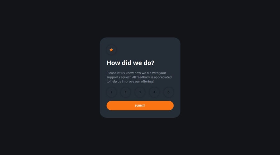
Design comparison
SolutionDesign
Community feedback
- @naveen-developerPosted 7 months ago
The code is well-structured and user-friendly; however, it lacks complete accessibility. For instance, the h1 and p tags include the tabindex="0" attribute, which is unnecessary. Only interactive elements should possess a tabindex attribute, allowing keyboard users to easily navigate to and activate these elements.
1@salomasikPosted 6 months ago@naveen-developer thanks for the comment! I'll go fix it)
0
Please log in to post a comment
Log in with GitHubJoin our Discord community
Join thousands of Frontend Mentor community members taking the challenges, sharing resources, helping each other, and chatting about all things front-end!
Join our Discord
