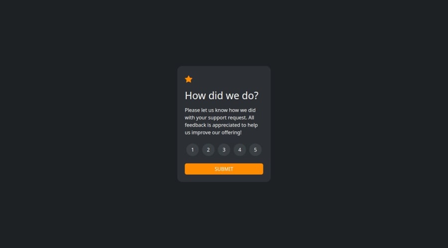
Design comparison
Solution retrospective
I’m proud of completing the project successfully and implementing a responsive design that works well across devices. Additionally, I improved accessibility by adding clear navigation and text contrasts.
What would you do differently next time? Next time, I would focus more on optimizing my code for performance and ensuring better cross-browser compatibility. I’d also spend more time testing for edge cases and user feedback before launch.
What challenges did you encounter, and how did you overcome them?One challenge I faced was ensuring the layout was responsive on all devices. To overcome this, I researched media queries and used a mobile-first approach, which made the design adaptable to different screen sizes. I also encountered issues with some JavaScript functionality, which I solved by debugging the code step by step and seeking help from online communities.
What specific areas of your project would you like help with?I would appreciate feedback on the following areas:
Code Optimization: Are there parts of my code that could be more efficient or simplified? Accessibility: Does the project meet accessibility standards, especially for users with disabilities? Cross-Browser Compatibility: Are there any issues with how my project works across different browsers or devices? Being specific in these areas will help me improve and refine my project further.
Community feedback
- @mudasirNadeemPosted about 1 month ago
Semantic HTML: Great job using semantic HTML elements! This enhances accessibility and SEO. Ensure all sections use appropriate tags to convey meaning effectively.
Accessibility: The solution is generally accessible, but consider these improvements:
Add alt attributes to images for better screen reader support. Ensure all interactive elements, like buttons and links, have visible focus states to improve navigation for keyboard users. Responsive Layout: The layout looks good on various screen sizes. It’s essential to test on smaller devices to ensure there are no issues with overflow or alignment.
Code Structure: The code is well-organized and easy to read. Consider breaking larger functions into smaller, reusable components for better maintainability.
Design Consistency: The solution closely follows the original design, with only minor deviations that don’t impact usability.
Overall, this is a solid solution with just a few areas for improvement. Keep up the great work!
0 - @mudasirNadeemPosted about 1 month ago
Semantic HTML: The solution effectively uses semantic HTML elements, which helps with accessibility and SEO. Consider using more specific tags (like <article>, <aside>, or <nav>) where appropriate to enhance clarity.
Accessibility: Overall, the solution is accessible, but here are some improvements:
Ensure all images have alt attributes for screen readers. Check that interactive elements (like buttons and links) have clear focus states. Responsive Layout: The layout adapts well across different screen sizes. It would be helpful to test on various devices, especially mobile, to ensure there are no overflow issues or misalignments.
Code Structure: The code is well-structured and readable, making it easy to follow. Consider breaking larger functions into smaller, reusable components to improve maintainability.
Design Consistency: The solution closely aligns with the original design. If there are any differences, they are minor and do not detract from the overall user experience.
Overall, this is a strong solution with minor areas for improvement. Great job, and keep up the excellent work!
0
Please log in to post a comment
Log in with GitHubJoin our Discord community
Join thousands of Frontend Mentor community members taking the challenges, sharing resources, helping each other, and chatting about all things front-end!
Join our Discord