Design comparison
Community feedback
- @elaineleungPosted about 2 years ago
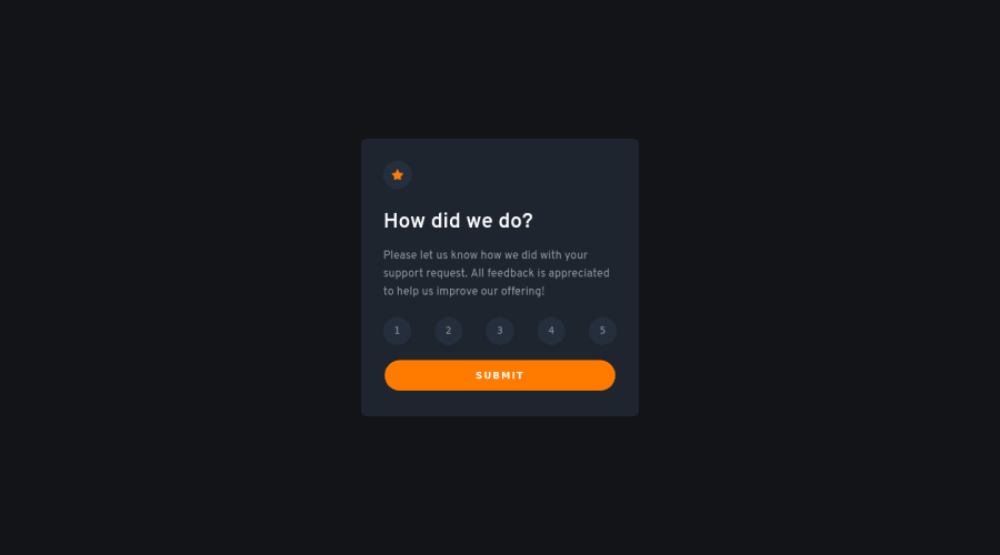
Hi Joseph, great work, and this looks pretty close to the design! I just got two comments here after playing around with the component:
-
If I hit submit without choosing a score, I still get brought to the thank you page and I see an empty
()in the selected score sentence. You can try and see whether you can write an if statement to prevent the user from going to the thank you page if there is no score recorded. -
If I select a button but click on something else (like background text or the image), then the button loses its selected color, and it looks like I did not choose any buttons. This is because you are using the focus state to change the color, and this can be a problem if the button loses focus, like what I described. To make sure that does not happen, try using a class instead for styling.
Here's a CodePen I made for this challenge that you can check out for ideas: https://codepen.io/elaineleung/pen/RwMqMxZ
Hope this helps you out 🙂
Marked as helpful0@Joseph-BenavidesPosted about 2 years ago@elaineleung Hey thank you so much Elaine, looking into it right now to further improve my code, I appreciate it!
1 -
Please log in to post a comment
Log in with GitHubJoin our Discord community
Join thousands of Frontend Mentor community members taking the challenges, sharing resources, helping each other, and chatting about all things front-end!
Join our Discord
