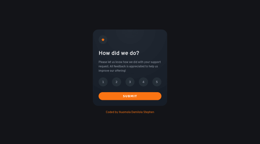
Responsive Interactive Rating Component using a Mobile-First Approach
Design comparison
Solution retrospective
Just started learning some JavaScript and this is my crack at doing some work on my own. I got to learn a whole lot while implementing some of the features of this project. I am open to suggestions on how I could do better.
- I got to work with ES6 classes.
- I got to learn about how the DOM works and also some of the methods and properties that can be used on HTML elements.
- I also to know the difference between a Node and an Element.
- I know using Parcel might have not been necessary to use but I wanted to learn how it works.
Some questions for the community?
- Are they better ways I could have made this accessible to more users?
- Did I implement some good coding practices during the small project?
- Are the hover and active states done very well?
Community feedback
- @VCaramesPosted almost 2 years ago
Hey there! 👋 Here are some suggestions to help improve your code:
- The “icons/illustrations” in this component are purely decorative. ⚠️ Their
alt tag
should be left blank and have anaria-hidden=“true”
to hide them from assistive technology.
More Info: 📚
[MDN Aria-Hidden] (https://developer.mozilla.org/en-US/docs/Web/Accessibility/ARIA/Attributes/aria-hidden#description)
- To ensure that the "rating buttons" are fully accessible 💯, they need to be built using a
form
⚠️.
- Everything will be wrapped inside a
fieldset
which will have alegend
that is visually hidden using CSS. - Inside, there should be five
input radios
and eachinput
should have alabel
attached to it to make the “ratings” accessible. - The last thing you will want to include will be a
button
so users can submit their choice.
More Info: 📚
- Once the top is implemented , for your JS, the
eventListener
should be on theform
⚠️ as asubmit
.
More Info:📚
Click vs. Submit EventListeners
If you have any questions or need further clarification, feel free to reach out to me.
Happy Coding! 🎆🎊🪅
Marked as helpful0@stephenikuomolaPosted almost 2 years ago@vcarames Wow thank you so much for the suggestions on how I can improve them I will work on them now and If I still have some problems for sure I will reach out to you about them. But overall was the work done good?
0 - The “icons/illustrations” in this component are purely decorative. ⚠️ Their
Please log in to post a comment
Log in with GitHubJoin our Discord community
Join thousands of Frontend Mentor community members taking the challenges, sharing resources, helping each other, and chatting about all things front-end!
Join our Discord