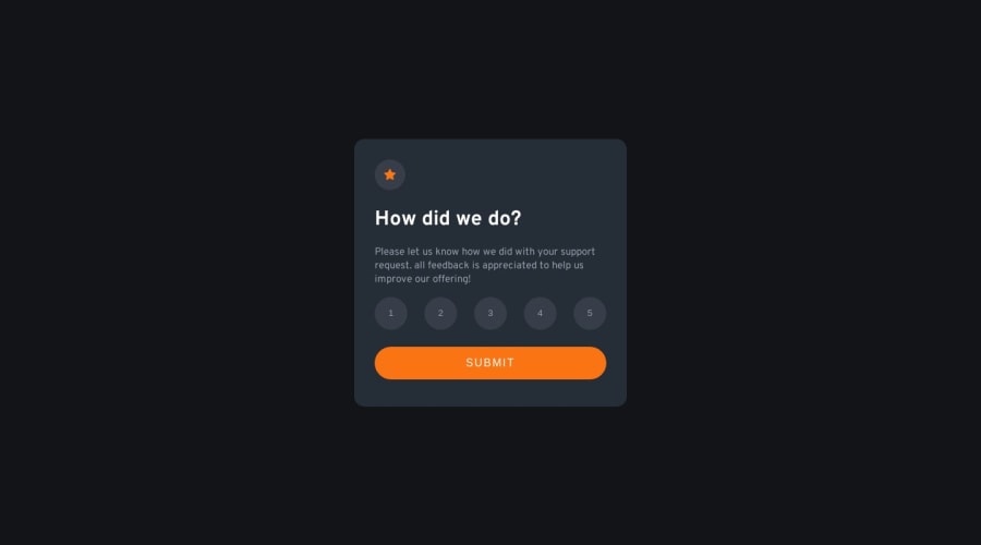
Design comparison
SolutionDesign
Solution retrospective
Hello guys. its been a while since i uploaded my solutions here. Well I'm backed now and please make sure to leave me feedbacks and recommendations so i can learn from you too.
Community feedback
- @NehalSahu8055Posted over 1 year ago
Hello Coder 👋.
Congratulations on successfully completing the challenge! 🎉
Few suggestions regarding design.
- For image like
.svg are decorativewhich screen reader will not render it to be important and skip it, so it make no sense to addalt leave it blank. - It would be better if you change the color on clicking the button inorder to know which button the user actually clicked.
I hope you find this helpful.
Happy coding😄
2@BrandaoAPosted over 1 year ago@NehalSahu8055 thanks. I actually just forget to fill in the alt 😂and also for the color changes I have updated them in my laptop already.
1 - For image like
Please log in to post a comment
Log in with GitHubJoin our Discord community
Join thousands of Frontend Mentor community members taking the challenges, sharing resources, helping each other, and chatting about all things front-end!
Join our Discord
