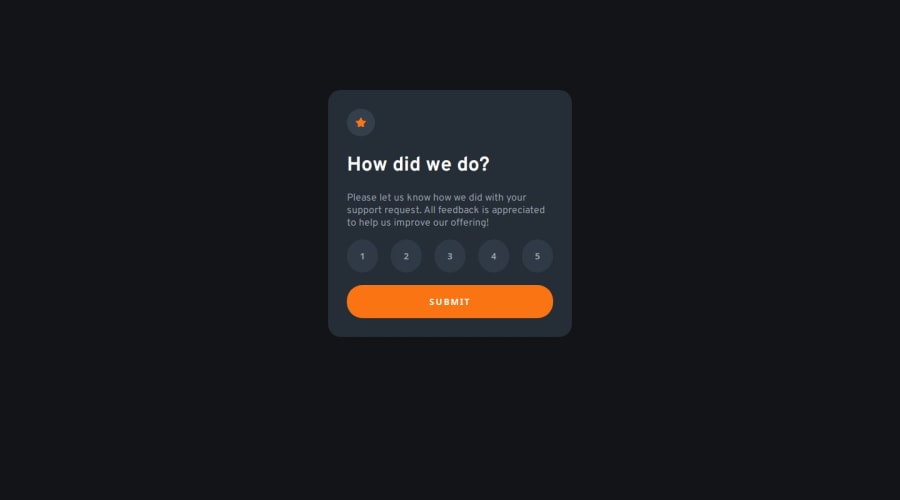
Design comparison
Solution retrospective
What am I most proud of? I used my intuition to decide on using a grid layout for structuring the buttons. This is probably a really common practice in the workplace but it was my first time correctly using a grid layout. I also wrote some JavaScript in this project without the help of anyone else, which is something new to me because I'm very new to JavaScript.
What would I do differently next time?
I think next time I would use input tags with a type of radio instead of button tags to create the clickable elements for selecting a rating. This might have solved a few issues I was running into while attempting to make the button tag function as a radio.
Question. For a project like this, would it have been more optimal to create two different states on the same page and use CSS to hide or show those two different states - or would it have been more ideal to create two separate HTML pages with one state each?
I chose the former method, but I'm curious what other people would have done and why!
Community feedback
- P@kodan96Posted 11 months ago
hi there! 🖖
The idea of creating a whole new HTML document for different phases of a process is not realistic.
In modern web development you have access to many tools, frameworks and libraries which makes it much easier to manipulate DOM elements. If you think of a bigger website, with several ways of interaction it's just not efficient to generate a whole new site for elements. On your journey sooner or later you'll get into JS and it's libraries or frameworks, and you'll learn it's not that hard to do these things.
Hope this helps! If you have any questions feel free to ask, I'll help if I can. Good luck and happy coding! 💪
Marked as helpful1@slackwareePosted 11 months ago@kodan96 I thought that method seemed more optimal. Thank you for the reassurance!
1 - @0xabdulkhaliqPosted 11 months ago
Hello there 👋. Congratulations on successfully completing the challenge! 🎉
- I have a suggestion regarding your code that I believe will be of great interest to you.
MAKING RATING FORM ACCESSIBLE :
- Currently the rating form is not accessible and because of using generic
buttonelements which are paired up with Javascript to handle the operation.
- This is your current markup,
<div class="buttonWrap">
  <button class="rateBtn" id="rateBtn" onclick="userRatingValue='1'">1</button>
  <button class="rateBtn" id="rateBtn" onclick="userRatingValue='2'">2</button>
  ...
</div>

<button type="submit" id="submit-btn">Submit</button>
- This is not a good way to build rating form, Instead we want to use
inputelement withtype="radio"which is wrapped insidefieldsetandform. By using radio buttons instead of normalbuttonwe can simply give checkboxes like options to select instead of relying on Javascript to work.
- So you can update your markup in this way,
<form>
  <fieldset>
    <legend class="sr-only">Please select a rating</legend>

    <div>
      <input type="radio" name="rating" id="rating-1" value="1">
      <label for="rating-1">1</label>
    </div>

    <div>
      <input type="radio" name="rating" id="rating-2" value="2">
      <label for="rating-2">2</label>
    </div>

    ....

 </fieldset>

  <button type="submit">
    Submit
  </button>
</form>
- I would highly recommend you to check out
my submissionfor this challenge, So that you could figure out how built this rating component in an inclusive way to prevent accessibility issues.
- If you have any questions or need further clarification then feel free to reach out to me.
.
I hope you find this helpful 😄 Above all, the solution you submitted is great !
Happy coding!
Marked as helpful1@slackwareePosted 11 months ago@0xabdulkhalid Thank you for the analysis! And yes, I do agree using
radioinstead of abuttonwould have been a better idea, I'll try to remember that the next time I need to create something that functions similarly to this project :)0 - P@danielmrz-devPosted 11 months ago
Hello there!
Congrats on completing the challenge! ✅
Your project is looking fantastic!
I'd like to suggest a way to make it even better:
- Using
marginisn't always the most effective method for centering an element.
Here's a highly efficient approach to position an element at the center of the page both vertically and horizontally:
📌 Apply this CSS to the body (avoid using
positionormarginsin order to work correctly):body { min-height: 100vh; display: flex; justify-content: center; align-items: center; }If you're using Tailwind, you can achieve the same with:
<body class="min-h-screen flex justify-center items-center">I hope you find this helpful!
Keep up the excellent work!
1 - Using
Please log in to post a comment
Log in with GitHubJoin our Discord community
Join thousands of Frontend Mentor community members taking the challenges, sharing resources, helping each other, and chatting about all things front-end!
Join our Discord
