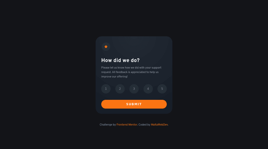
Design comparison
Solution retrospective
-
Is this solution complete, or should I really create a separate class for the rating buttons' active states? At the moment there's no "state" as such, only the variable ratingScore.
-
The "You selected 3 out of 5" text looks slightly too high in it's div to me, can you confirm? I can't see any reason why it would be out, it has 8px top and bottom padding and should inherit display:flex, align-items:center and justify-content:center from its parent.
-
How important and relevant is it to use a CSS preprocessor like SASS? Would you recommend that I change? I'm aiming to become a full-stack dev one day.
-
Do my commits look okay? Any feedback there about using Github in a professional setting.
-
Any other suggestions about best practices? Again bearing in mind that I'm aiming to learn to produce production-quality code.
Cheers!
Community feedback
- @correlucasPosted about 2 years ago
👾Hello MaltaWebDev, congratulations on completing this challenge!
Nice code and nice solution! You did a good job here putting everything together. I’ve some suggestions for you:
Your component is perfect, but is not responsive yet, this is due the
fixed width
you've applied to the container.Look bothwidth
andmax-width
the main difference between these properties is that the first(width) is fixed and the second(max-width) isflexible
, for example, a component withwidth: 340px
will not grow or shrink because the size will be ever the same, but a container withmax-width: 340px
ormin-width: 340px
can grow or contract depending of the property you've set for the container. So if you want a responsive block element, never usewidth
choose ormin-width
ormax-width
.To improve the card overall responsibility, you can start to add
flex-wrap
inside the class that manages the section for therating numbers button
and makes the adjust to fit in different rows while the container scales down, not that without this property the container doesn't shrink. Here's the code applying these changes:.rating-buttons { display: flex; justify-content: space-between; margin-bottom: 35px; padding: 0 20px 0 20px; flex-wrap: wrap; }
✌️ I hope this helps you and happy coding!
Marked as helpful0 - @siavhnzPosted about 2 years ago
Hello MaltaWebDev
In Slack, you asked about comparing work and design, I use perfect pixel extension for my solutions which is a great tool for comparing when working on a challenge.
here is a link to the Pixel Prefect Chrome extension
Happy coding
Marked as helpful0 - @AdrianoEscarabotePosted almost 2 years ago
Hello MaltaWebDev!!
I noticed that your link to the active page is not working to fix this added this link:
https://maltawebdev.github.io/RatingCard/
1
Please log in to post a comment
Log in with GitHubJoin our Discord community
Join thousands of Frontend Mentor community members taking the challenges, sharing resources, helping each other, and chatting about all things front-end!
Join our Discord