Not Found
Not Found
Not Found
Not Found
Not Found
Not Found
Not Found
Not Found
Not Found
Not Found
Not Found
Not Found
Request failed with status code 502
Not Found
Not Found
Not Found
Not Found
Not Found
Not Found
Not Found

Submitted

Interactive Rating Component (HTML | CSS | JS Vanilla)

Cheosphere 1,040

@Cheosphere

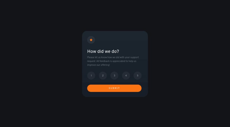
Desktop design screenshot for the Interactive rating component coding challenge

This is a solution for...

  • HTML
  • CSS
  • JS
1newbie
View challenge

Design comparison


SolutionDesign

Solution retrospective


...made with a lot of love 🤘🏻🙂

Community feedback

Lucas 👾 104,420

@correlucas

Posted

👾Hello Cheosphere, congratulations for your new solution!

🎯 Your solution its almost done and I’ve some tips to help you to improve it:

1.REMOVE THE SHADOW AND THE BLACK BACKGROUND FROM THE CONTAINER, ADD IT TO THE BODY

.contenedor {
    width: 1440px;
    height: 800px;
    display: flex;
    justify-content: center;
    align-items: center;
    flex-direction: column;
    /* background-color: hsl(216, 12%, 8%); */
    /* box-shadow: 0 0 40px rgb(36 36 36); */
    transition: all .4s ease-in-out;
}

body {
    background-color: hsl(216, 12%, 8%);
    display: flex;
    justify-content: center;
    align-items: center;
    font-family: 'Overpass', sans-serif;
    /* background-color: rgb(30, 30, 30); */
    color: hsl(0, 0%, 100%);
}

2.REMOVE THE HEIGHT FROM THE CARD TO MAKE IT GROW AUTOMATICALLY, NOT THE AFTER THE height: 416px; YOUR CONTENT START TO POP OUT THE CONTAINER

.card {
    width: 412px;
    /* height: 416px; */
    padding: 2rem;
    display: flex;
    flex-direction: column;
    align-items: flex-start;
    justify-content: space-between;
    border-radius: 30px;
    background: linear-gradient(0deg, rgba(23, 30, 40, 1) 0%, rgb(30, 39, 48) 100%);
}

✌️ I hope this helps you and happy coding!

Marked as helpful

2
wess-MHHW 620

@wess-MHHW

Posted

Hello Cheosphere,

I'm truly impressed by your skills and the quality of your work. I consistently find myself comparing my solutions to yours and thoroughly reviewing the code.

In this challenge, you performed exceptionally well, as always. However, there's a minor issue with the Mobile S - 320px view.

The paragraph of the first card collapses with the title due to a negative margin-top in the following code:

.parrafo {
    margin-top: -22px;
    font-size: 0.96rem;
    font-weight: 200;
    line-height: 24px;
    color: hsl(217, 12%, 63%);
}

To address this, I suggest setting a specific margin for mobile devices, as demonstrated in the code snippet below:

@media screen and (max-width: 450px) {
    .parrafo {
        /* Set your preferred value */
        margin-top: 0;
    }
}

Keep up the excellent work, mate!

Marked as helpful

1

Cheosphere 1,040

@Cheosphere

Posted

@wess-MHHW Thank you very much for your comment, I have just resolved the detail you mention, I initially adjusted this project up to 375px screen width, but now it is better adjusted for a 320px wide screen.

0

@andrew-g-ayad

Posted

Hey Cheosphere Your work is awesome! And I loved how accurate it is and the fact you put much effort to make it look as close as possible to the original design. but here's a little trick.. the original card design has a really small amount of extra padding-right

Try it out and I'm sure your design will match the original design a 100%

Marked as helpful

1

Cheosphere 1,040

@Cheosphere

Posted

@andrew-g-ayad Thank you very much for your comment, sorry if my English is not very good, I use a translator 😅 ...there is indeed a margin to the right as you indicate, but I preferred to leave the content totally centered, it's just a personal obsession. Thank you for your words, I send you a big hug from Chile.

1

@OlamideAfunsho

Posted

How did you get the original measurements of the design

1

Cheosphere 1,040

@Cheosphere

Posted

@OlamideAfunsho, Hello, I got the measurements using photoshop, in this software you can open the "desktop-design.jpg" file, which is included in the project files folder, and so you can get the exact sizes, margins and spacing of the original design , to apply them in your development.

0

@OlamideAfunsho

Posted

@Cheosphere Thanks a lot

1

@OlamideAfunsho

Posted

@Cheosphere can you also use illustrator

1
Cheosphere 1,040

@Cheosphere

Posted

@OlamideAfunsho, Hello!, of course, Illustrator can also be used.

0

@OlamideAfunsho

Posted

@Cheosphere if you don't mind, can you put me through on the steps to get the design's original measurements.

1
Cheosphere 1,040

@Cheosphere

Posted

@OlamideAfunsho, What I do is open the "desktop-design.jpg" file, it can be in Photoshop or Illustrator, and using the ruler tool (setting its measurement unit in pixels) I can get the sizes, spaces and margins of each one of the items. The same process applies to the mobile version, which is found in the "mobile-design.jpg" file. You can also access the files in Figma, but for that you need to get the Pro version of Frontend Mentor.

1

@OlamideAfunsho

Posted

@Cheosphere thanks a lot

0

Please log in to post a comment

Log in with GitHub
Discord logo

Join our Discord community

Join thousands of Frontend Mentor community members taking the challenges, sharing resources, helping each other, and chatting about all things front-end!

Join our Discord