Design comparison
Solution retrospective
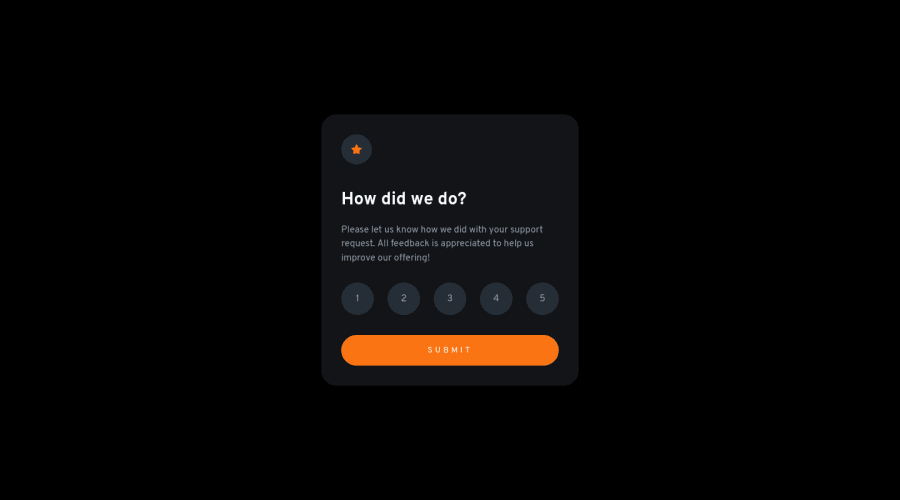
Hi everyone, this is my attempt at the Rating Component challenge. For this challenge, I decided to give it a go in pure JS even though React would be better suited for this type of component and state management. If there's a cleaner/better way for it to be done in pure JS, please let me know.
I styled the rating buttons by customising radio inputs. In my research, I found that setting the input itself to display: none or visibility: hidden isn't good for accessibility purposes, so I decided to set the inputs to opacity: 0 and width: 0 so they still "render". I'd appreciate any feedback on better accessible approach to my solution. Thanks!
Community feedback
Please log in to post a comment
Log in with GitHubJoin our Discord community
Join thousands of Frontend Mentor community members taking the challenges, sharing resources, helping each other, and chatting about all things front-end!
Join our Discord
