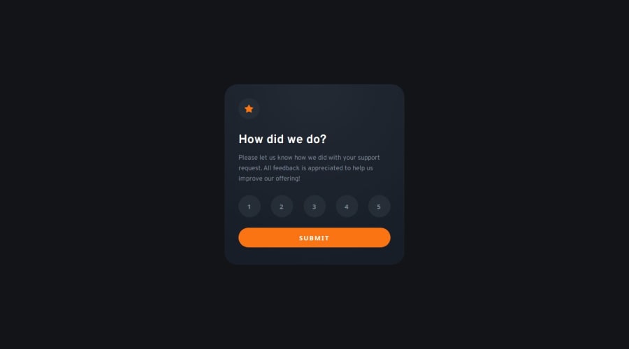
Interactive rating component (HTML, CSS, and Vanilla Javascript)
Design comparison
Community feedback
- @VenusYPosted 9 months ago
I'm posting this as a separate comment and not a reply in case you find this helpful.
After clicking a rating button, it turns a lighter grey, which indicates that the user has selected that rating. This is fine and expected.
However, clicking off the button causes it to go back to its default styling, which suggests that it's no longer selected, but pressing the submit button will cause the page to proceed to the 'thank you' page with that rating anyway.
I see you have an event listener that changes the innerHTML of the rating message on the 'thank you' page when the user clicks on a rating button:
rates.forEach((rate) => {
  rate.addEventListener("click", () => {
    rating.innerHTML = rate.innerHTML;
  });
});
I suggest listening for a click outside of a rating button (and also not on the submit button) to reset the
rating.innerHTMLback to""to make the functionality of the page more intuitive.Alternatively, you could make it so that the button does not appear to lose focus upon clicking off it, which might be an easier approach.
Hope this helps! :)
Marked as helpful1@solvmanPosted 9 months ago@VenusY
I couldn't think of a way to turn off
un-focusonly when someone clicks out of the button array. I figured I would track button selection through.button--selected:.button--selected, .button--ghost:focus { color: var(--color-neutral-100); background-color: var(--color-neutral-500); }I clear the button selection first and then add
.button--selectedto the clicked button.rates.forEach((rate) => { rate.addEventListener("click", () => { clearRatings(); rate.classList.add("button--selected"); rating.innerHTML = rate.innerHTML; }); }); ... const clearRatings = () => { rates.forEach((rate) => { rate.classList.remove("button--selected"); }); };It works as expected. Thanks again for the time you took to review my code! 🙏
1@VenusYPosted 9 months ago@solvman No problem! Glad I could help you out, and great job on figuring out a solution for this issue. :)
1 - @VenusYPosted 9 months ago
Great work! This is a really good solution to this challenge. The buttons work well, and the styling very closely resembles the design mockups, so well done.
However, one thing I would point out is that the body's
heightproperty is set to100vh, which causes some issues when the screen size is too small to fit the entire card vertically. In other words, when the height of the card is greater than the height of the viewport.A simple fix for this is changing
heighttomin-heightand leaving the value at100vh. This will make the body take up the entire viewport height while still letting it expand if necessary.0@solvmanPosted 9 months ago@VenusY
Good eye 🤩 Thank you 🙏
Unfortunately, your proposed solution won't work since it removes the ability to center the card vertically within the Grid container. In addition, it creates horizontal overflow on a small width with a large height. I believe a correct solution would be:
height: max(405px, 100vh);Thank you very much for taking the time to look at my work 🫶
1@VenusYPosted 9 months ago@solvman Ah, upon looking at my comment again, I've noticed that I've made a mistake. Instead of
max-width, I meantmax-height. Sorry for the confusion, I'll edit my comment to make it clearer.Although, if you've managed to find a solution all on your own, that's great!
1
Please log in to post a comment
Log in with GitHubJoin our Discord community
Join thousands of Frontend Mentor community members taking the challenges, sharing resources, helping each other, and chatting about all things front-end!
Join our Discord
