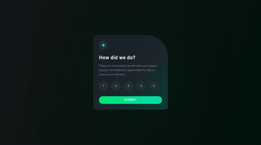
Interactive Rating Component (JS + Custom Design + Modal)
Design comparison
Solution retrospective
👾 Hello, Frontend Mentor community. This is my solution for the Interactive Rating Component
This challenge was quite hard, was my first real Javascript challenge ever. I took a lots of time trying to find out how to make the rating buttons connect to the submit button to display the output popup showing the selected number. I had look several tutorial videos to understand the JS structure so I follow a video from this channel in youtube TsbSankara - JavaScript - Interactive Rating Component. Once I did the basic challenge I created a modal screen to request the user to select a button before submit, for the second step I had to ask a friend @AdrianoEscarabote for help and after a lots of his patience and some explanations I get it.
🎨 I added some custom features:
- 👨🔬 Custom UI Design + Animations.
- 🧚♀️ Custom Modal Popup
If you can add something or give me some tip. I'll be happy to hear any feedback and advice!
Community feedback
- @VCaramesPosted almost 2 years ago
Congrats on complete this challenge and welcome back! 🎊🎆🍻 (Been a while since your last submit).
Beautiful design like always! 😍
Here are some suggestions:
- To ensure that the "rating buttons" are fully accessible 💯, they need to be built using a
form
⚠️ (along with alegend
) and inside of it, there should be fiveinput radios
and eachinput
should have alabel
attached to it to make the buttons accessible. Wrap all theinputs
andlabels
inside afieldset
to prevent users from making more than one selection. Lastly, abutton
will be the last thing before closing theform
.
More Info: 📚
- Once the top is implemented , for your JS, the
eventListener
should be on theform
⚠️ as asubmit
.
More Info:📚
Click vs. Submit EventListeners
- To get the ‘rating’ ⚠️ you would use
const rating = form. querySelector (" input [type= 'radio']: checked")
- ⚠️ Do not forget to convert you CSS units to relative units.
Happy Coding! 🎆🎊🪅
Marked as helpful5@correlucasPosted almost 2 years ago@vcarames Thank you! I'll apply these changes soon.
0@grace-snowPosted almost 2 years ago@correlucas 100% this advice above is essential for the challenge.
It's a html form and you should be listening for the submit event. Theres really no other corect way for this one.
You also need to remove the articles from this. You're misusing the element. It cannot be used to break up related content. Articles have a specific semantic meaning for encapsulating content that can be syndicated on other pages or sites. It is not a general element to group small bits of layout together.
Once you've fixed the html, you will need to change your js. You should be learning to work with the form data.
Another accessibility point. If you are going to change the design, that's fibe to do but you must not make it less accessible. I can't read the button or selected states on this because of the white on light green.
With modals there is now a dialog element for that purpose. They have specific accessibility challenges around focus management that I'm not going to go into in detail, but again it's important to only use them once you understand these requirements and how to address them. It's a nice idea but not correctly implemented at the moment.
My general advice is to keep things simple. Work through the challenges in their simplest way first, focusing on code quality. Then if you want to extend later you can do that once you know a solid foundations been laid.
Other advice is to consider semantics and accessibility at every stage. It's so important and you can't afford to leave learning it until later. Think about keyboard, screen magnification, vision impairment and screenreaders as a minimum. If you do, you'll become a truly excellent developer.
Good luck
Marked as helpful1@correlucasPosted almost 2 years ago@grace-snow Hey Grace, thank you for the feedback!
-
About the article, in this case I wrap everything inside a main/div and that's fine?
-
I've really few knowledge in JS, I am following a course and I wanted to try this challenge, but since I didn't knew yet how to work with forms I tried to make the challenge in the other way (I didn't knew the only to do it was using forms). I'll do the challenge again using the rating buttons and submit using a form/radial buttons instead of using a list of buttons.
-
I'll pay more attention to these design/accessibility details. I wasn't aware of that.
Anyway, thank you a lot, next time a face an challenge like that I'll use a form instead of trying something else 😁
Thanks =)
0@correlucasPosted almost 2 years ago@vcarames Hey bro I updated my code, here's the live site https://relaxed-phoenix-dd38fe.netlify.app/
0@VCaramesPosted almost 2 years ago@correlucas
Nice job implementing the
radio inputs
! Do not forget to add thelegend
inside theform
(it should visually hidden and state something like, "Please select a rating…")For the “thank you” content, you’ll need to announce the changes to your content when it appears to screen readers.
So you’ll need to wrap the entire “thank you” content in a an
div
and give it anaria-live="polite"
(there should be nothing else on thisdiv
).More Info: 📚
You were going on the right direction here in your JS;
// form.addEventListener("submit", (ev) => { // ev.preventDefault() // output.classList.remove('hidden'); // input.classList.add('hidden'); // })
It should be something like this;
form. addEventListener ("submit", (e) => { e.preventDefault ( ); const rating = document.querySelector ("input [type= 'radio': checked").value; userselection.textContent = 'You selected ${rating} out of 5; Remove/add classes/attributes });
Besides the modal (I haven’t studied them yet), your HTML should be good to go.
Marked as helpful1@correlucasPosted almost 2 years ago@vcarames Hey bro! Thank you again for the feedback, was really useful the info you gave me. May I ask you where did you learn this stuff about the html/accessibility and JS?
The JS part I had a hard time trying to understand it, so I'll study a little bit more my course to try it again soon.
Anyway, thank you a lot!
1@VCaramesPosted almost 2 years ago@correlucas
I’m glad I was able to help you out.
Honestly, I just read as much as I can on Google, https://developer.mozilla.org/en-US/ and https://dev.to/ (I made it a habit every morning after the gym) and then try implementing whatever it is I’m trying to build as best I can. If I’m stuck or have any hesitations (if I can’t find an "answer’ online) I will ask on the Slack channel’s #help, you’ll get more feedback there than on the FEM site.
For HTML, https://developer.mozilla.org/en-US/ is my go to for pretty much everything related to HTML (you’ll notice that it is the main source I give everyone in my comments); it is a gold mine! Not only does it show you the HTML code it also shows you how to use JS with the HTML code. That’s how I learned about the
form
element and theradio inputs
.For the accessibility, I began placing more emphasis on this when it comes to my web development. So when I Google something, I always include the text "accessible". This helps filter out anything that is non-accessible. And my go to site is https://www.w3.org/WAI/ it has everything regarding accessible web development.
Also by the end of the month Grace (she’s the queen of accessibility) will be releasing her own site regarding accessible web development https://fedmentor.dev/ so I recommend signing up for her newsletter.
For the JS, I know how you feel. It took me a while to understand how it worked. I ended up taking this Udemy course last year on August, https://www.udemy.com/course/the-complete-javascript-course/, unfortunately, I didn’t finish it 100%.
Once I understood the basics I stopped watching and began implementing my own JS code. But I try to keep it simple as possible (the less code the better). I use HTML and CSS as much as I can and only use JS when needed.
Hopefully that helps.
0 - To ensure that the "rating buttons" are fully accessible 💯, they need to be built using a
- @sodiqmakindePosted over 1 year ago
This is really an amazing UI, it will be nice if the selected number can be highlighted when the user click on any number before submitting their rates. Apart from this, I will saying this is really a great design with amazing animation. ☺️
Marked as helpful0 - @wendyhamelPosted almost 2 years ago
I'm a bit late to the party but I have some food for thought on this challenge. You got some excellent advice here already!
I like the custom design you mixed in this challenge.
When I read about the modal you implemented and the advice Grace gave you about it, I thought about a simpler way to address the problem of not submitting an empty form. You could disable the button until the user gives a rating. This way you can't submit the rating empty and you do not need the modal and all the code; accessible html and javascript needed to make the modal work properly.
I looked at my own version of this challenge and I could certainly improve it as well. At the time my focus for the challenge lay in exploring alpine.js and implementing transitions. Maybe I'll give it another go myself.
Happy coding!
Marked as helpful0@correlucasPosted almost 2 years ago@wendyhamel Hey thank you for the tips, can you point me the proper way to apply the modal woth accessible html?
0@wendyhamelPosted almost 2 years ago@correlucas That's not a short or easy anwser. It's a combination of html and javascript to get it to work nicely accessible. You have to add aria attributes to the different parts of the modal like
aria-labelledby
,aria-modal
and therole='dialog'
attribute. Thearia-modal
has to betrue
if the modal is opened andfalse
if it is closed. You need to control this with javascript.Read more on the MDN docs about aria-modal
But as @grace-snow mentioned the dialog element is a good one to use. A lot of what you need is baked into that.
more MDN information about the dialog
Some more information, if you're interested; The focus issue @grace-snow mentioned is also a problem if you make your own modal. It is a complicated bunch of javascript to keep the focus within the modal.
For example you don't want users to be able to tab out of a modal where you require an answer before the user can move on. With javascript you can write code to give other elements on the page
aria-hidden='true'
to prevent the user to be able to tab out of the modal. There can be scroll issues as well. Most of the time you don't want the page to scroll behind the modal.It gets very complicated.
I hope you don't get a headache ;)
Happy coding
Marked as helpful0 - @chukwudobe-MicahPosted almost 2 years ago
Lucas is back! My browser doesn't lete access the site though. It says "deceptive site ahead".
Marked as helpful0@correlucasPosted almost 2 years ago@chukwudobe-Micah I have no idea why I am having this error I redeploy in Netlify to see if it fixes. Here's the link of the Netlify site https://63b3ef8d238dde495e34abaa--relaxed-phoenix-dd38fe.netlify.app/
0@chukwudobe-MicahPosted almost 2 years ago@correlucas I just checked it out and it worked.😌 Good work man, I'll be joining you on these projects soon. I followed you on twitter, I'm expecting a follow back. I want to be friends, work together and grow together since we're both chasing the same career. My display name here is the same the with the name of my twitter account name leaving out the "Chinedu", same profile picture too.
0@correlucasPosted almost 2 years ago@chukwudobe-Micah Thank you bro! I didn't saw it sorry. Now I've followed you. I saw that you're doing amazing stuff with JS since you're already working with API and etc. This is amazing. I'm studying the basics yet, like DOM for now. I hope to try some other challenge soon.
Have a nice day ✌
2@chukwudobe-MicahPosted almost 2 years ago@correlucas thank you brother, you're doing very good too. I hope we get to share knowledge and work together soon.
0 - @ChamuMutezvaPosted almost 2 years ago
Hi Lucas Well done with your challenge so far. Here are some improvements that I would suggest.
- some images are decorative , hence they should have an empty alt value. If the image is not decorative, the alt value has to be beneficial to assistive technology users or in the case the image fails to load. For example
<img src="./images/icon-star.svg" alt="Star Icon">
, words like icon, image, graphic, picture etc are usually read by screen readers and should not be part of the alt value (can simply cause confusion through repetition of words). The alt value is generally the message contained in the image. In my opinion the star is purely decorative in this example. - the first heading of a site should be an h1 element, if it is a book the h1 will be the equivalent of the book title then the other heading should follow a sequential order.
- consider also using tools to validate your code
<h2> Please give us feedback before submitting ✌</h3>
. Here an h2 is mixed with an h3 - when a selection has to be made from a group elements (one selection) , the most suitable element will be a group of radio-buttons
Good luck
Marked as helpful0 - some images are decorative , hence they should have an empty alt value. If the image is not decorative, the alt value has to be beneficial to assistive technology users or in the case the image fails to load. For example
- @sidneyfrancoisPosted over 1 year ago
Muito bom, eu mesmo sempre evitei css mas ver trabalhos assim me deu ânimo. Eu ainda to no básico e andando, aprendendo fazendo mesmo.
1 - @FelipeFamaPosted almost 2 years ago
Congratulations on the excellent work !
1
Please log in to post a comment
Log in with GitHubJoin our Discord community
Join thousands of Frontend Mentor community members taking the challenges, sharing resources, helping each other, and chatting about all things front-end!
Join our Discord