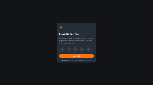
Submitted over 3 years agoA solution to the Interactive rating component challenge
Interactive Rating Component
P
@hectorlil48

Solution retrospective
What are you most proud of, and what would you do differently next time?
I am following along on this learning path and this project I completed three years ago. I am proud that I am still coding and that my skills have improved. If I were to do it again I would improve some style choices and make it more accessible.
What challenges did you encounter, and how did you overcome them?One of the problems I had when I was doing the project was to prevent the browser from refreshing when reloading. I learned to use prevent default when working on my function.
What specific areas of your project would you like help with?I have learned more from this project. I would probably do it in React if I were to re-make it.
Code
Loading...
Please log in to post a comment
Log in with GitHubCommunity feedback
No feedback yet. Be the first to give feedback on Hector Ramirez's solution.
Join our Discord community
Join thousands of Frontend Mentor community members taking the challenges, sharing resources, helping each other, and chatting about all things front-end!
Join our Discord