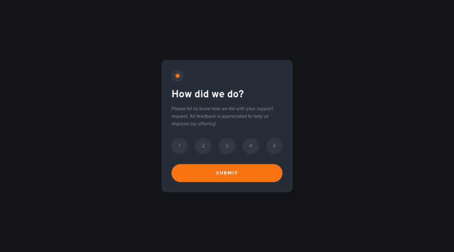
Design comparison
Solution retrospective
Hi, there! I just completed this challenge. Just like other challenges, this was also a lot of fun. Implemented CUBE CSS for the first time in practice.
I think it is the first 'site' that I mostly focused on its a11y. I mean, for rating scores, I used input with type="radio", made aria-hidden="true" for numbers, and set names for each number, like satisfied, ok, e.t.c. I thought, it would be meaningless for those who use screen readers that read numbers aloud.
Also, it turned out to be the best practice in terms of functionality as it required a few lines of code in JavaScript. All in all, I am happy with that.
I would be grateful if you could inspect my code and tell which part I can improve.
Community feedback
Please log in to post a comment
Log in with GitHubJoin our Discord community
Join thousands of Frontend Mentor community members taking the challenges, sharing resources, helping each other, and chatting about all things front-end!
Join our Discord
