Design comparison
SolutionDesign
Solution retrospective
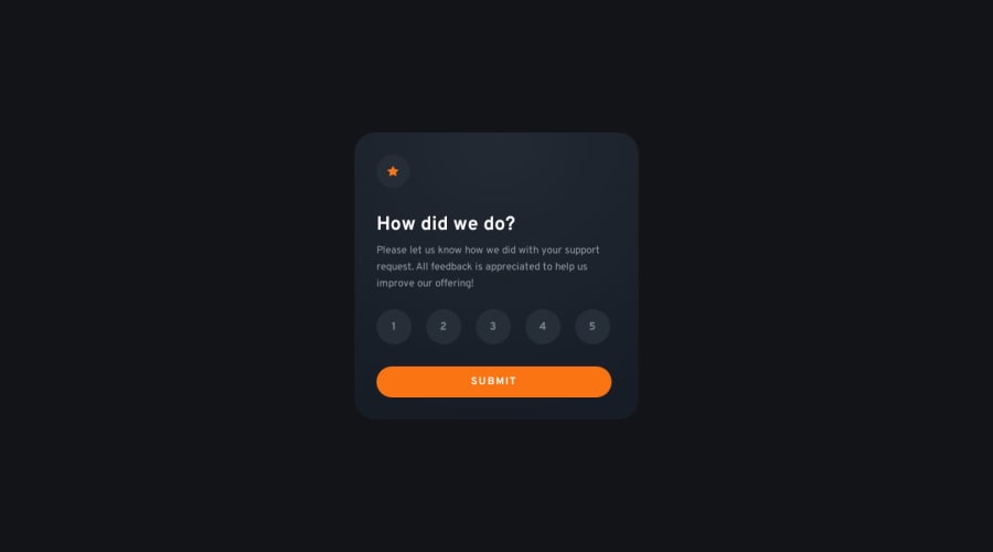
First project using the Figma file with PRO sub. SO worth it as it saves a lot of back and forth but there is some margin issue with text elements that I can't figure out. Even following design doc to the letter text was never quite right but I managed to manually adjust around it. Something to do with margin/alignment of text elements I think...
Community feedback
Please log in to post a comment
Log in with GitHubJoin our Discord community
Join thousands of Frontend Mentor community members taking the challenges, sharing resources, helping each other, and chatting about all things front-end!
Join our Discord
