

Design comparison
SolutionDesign

Solution retrospective
Hello there)
That's my first solution on this platform so i have some questions and i will be really grateful for feedback :
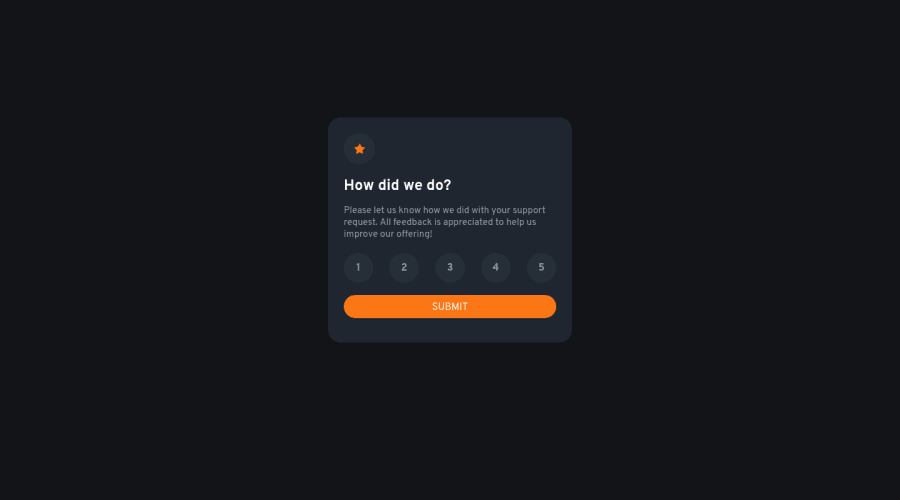
- I think my solution isn't that similar to the images in the challenge. I don't have pro subscription(i wasn't using figma/sketch version) so it was hard to set all sizes and colors by eye. What do u think about it?
- Also, I used color picker to find the right colors(from the challenge images) instead of using colors in "style guide.md" file, cause it was one color missing in that file and I was confused by that. The missing color is the color for background of the buttons in untouched state. Is that good approach to use color pickers ?
- I was practicing my vue.js skills. Could you tell something about my approach to this challenge. I think the way i programmed rating buttons isn't the best way. I have separate events and variables for each of them. Any advice ?
- I used
<div>tags to make boxes to use them as buttons in the rating component, but maybe i should have used styled<input type="checkbox">in the<form>instead ?
Community feedback
Please log in to post a comment
Log in with GitHubJoin our Discord community
Join thousands of Frontend Mentor community members taking the challenges, sharing resources, helping each other, and chatting about all things front-end!
Join our Discord