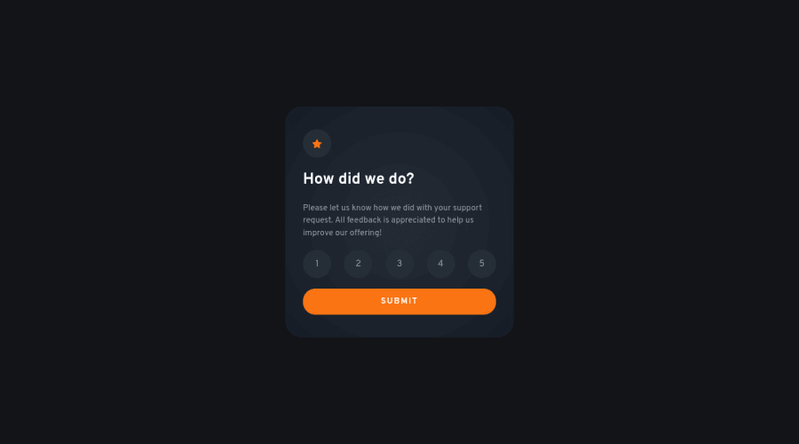
Design comparison
Solution retrospective
That was awesome! It's my debute with DOM manipulation.
Tbh: to the JS part I watched a tutorial, but I feel like Katas from codewars.com have trained me in advance.
With a little cheatsheet I'll be fine 😁 Peace ✌
Community feedback
- @elaineleungPosted over 2 years ago
Hi Kulek, I think you did a good job here! I'm glad you got to practice some of the knowledge from CodeWars, and using a tutorial is a good start to help you understand some of the concepts behind this.
Probably the only suggestion I have right now is, instead of having "you selected nothing" if the user doesn't select anything, try putting in some conditional logic in the JS to prevent the user from advancing to the thank you page, like,
if (this condition is fulfilled) { // run this code! }
Great job working on this, and keep practicing 😊
Marked as helpful1@kkulekPosted over 2 years ago@elaineleung sure thing!
I decided to focus on delivering next projects according to the briefs instead of polishing every little detail.
But after this challenge I have noted 6 features I need to learn and what you mentioned is one of them. They'll wait for my portfolio's projects :).
Have a good one Elaine!
1@elaineleungPosted over 2 years ago@kkulek Sounds good Kulek! I agree, I think as long as everything works according to the design requirements, then it's good enough. I do find it helpful that as I'm working on new challenges, I learn new things and then I go back to some old challenges to make improvements or fix stuff that I did wrong. Anyway, keep it up! 🙂
1 - @Hussain760Posted over 2 years ago
Hi there Kulek !
your solution are really good it help me a lot
Thanks once again
1@kkulekPosted over 2 years ago@Hussain5325 that's so kind Hussain! Thank you and I'm a begginer too.
Maybe these 4-videos series would be good fit for you: https://www.youtube.com/watch?v=h3bTwCqX4ns
Kevin is doing a challenge from the frontmentor.
He has helped me to organize a beggining of a project and switch from the px to rem/em, few takeaways of mine:
-
Setting a good :root (especially fonts and theirs corelation across resolutions) will save tons of a time - without that I was creating hudge mess in the CSS while working on @media queries.
-
Pixels aren't best idea when you want to work on the responsive project. Relatives are just better fit (here is few minutes about that topic: https://www.youtube.com/watch?v=_-aDOAMmDHI)
-
It's an obvious thing now, but wasn't before for me. Work on the project from the ground up: from the smallest resolution and add @media queries when needed.
-
Plan whole project in advance (all the boxes/containers, relation between resolutions etc.). 10-20 minutes on that saved me 1-3 hours on the other project, and I think it's a great practice even on small projects, to just be prepared for the bigger ones.
-
BEM (naming structure for the CSS): I'm still learning that (and making my mistakes), but use this or similar methodology to train and organize your CSS.
Good luck :)
2 -
- @MahdiSohailyPosted over 2 years ago
your design is looking perfectly fine. just a little suggestion, it will be better if the user can come back to the rating page once he/she submitted the form. Maybe you can do it by adding an event listener to the body to hide the welcome message and display the form again.
1@kkulekPosted over 2 years ago@MahdiSohaily it's there my friend maybe it's not huge button, but from UX perspective, I think it's fine ;)
2@elaineleungPosted over 2 years ago@kkulek I agree about the UX, and I'd leave it as it is. I think that as an exercise it's OK to return to the rating page if people want to design it that way. In a real world scenario and in many of these ratings I've seen, there usually isn't the option given to return to the rating page. This makes sense because you'd want to prevent the same person giving multiple ratings, as that would rig the results and kind of defeat the purpose of having a rating. In some cases like a contact form, it would be nice to return to the previous page.
2@kkulekPosted over 2 years ago@elaineleung 100% agree.
I see that I should reade more of your posts. and I'm sure many of them will be mark as helpful 😅✌
1
Please log in to post a comment
Log in with GitHubJoin our Discord community
Join thousands of Frontend Mentor community members taking the challenges, sharing resources, helping each other, and chatting about all things front-end!
Join our Discord