Design comparison
Solution retrospective
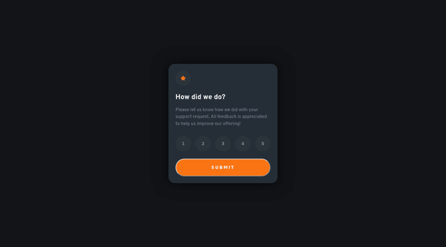
Here is my solution to the Interactive rating component β¨
I've got some trouble with the "JS part" of this challenge. Could I make it better?
π Happy to hear any feedback and advice. Thanks!
Community feedback
- @VCaramesPosted almost 2 years ago
Hey there! π Here are some suggestions to help improve your code:
- The
article
andsection
elements are being used incorrectly β and not needed for this challenge.
- The βicons/illustrationsβ in this component are purely decorative. β οΈ Their
alt tag
should be left blank and have anaria-hidden=βtrueβ
to hide them from assistive technology.
More Info: π
[MDN Aria-Hidden] (https://developer.mozilla.org/en-US/docs/Web/Accessibility/ARIA/Attributes/aria-hidden#description)
- To ensure that the "rating buttons" are fully accessible π―, they need to be built using a
form
β οΈ.
- Everything will be wrapped inside a
fieldset
which will have alegend
that is visually hidden using CSS. - Inside, there should be five
input radios
and eachinput
should have alabel
attached to it to make the βratingsβ accessible. - The last thing you will want to include will be a
button
so users can submit their choice.
More Info: π
- Once the top is implemented , for your JS, the
eventListener
should be on theform
β οΈ as asubmit
.
More Info:π
Click vs. Submit EventListeners
If you have any questions or need further clarification, feel free to reach out to me.
Happy Coding! πππͺ
Marked as helpful1@PaulaR-05Posted almost 2 years ago@vcarames Thanks for all! I'm going to read all the links you sent me! :)
1@VCaramesPosted almost 2 years ago@PaulaR-05
Glad I could help! π
1 - The
Please log in to post a comment
Log in with GitHubJoin our Discord community
Join thousands of Frontend Mentor community members taking the challenges, sharing resources, helping each other, and chatting about all things front-end!
Join our Discord