Submitted 5 months ago
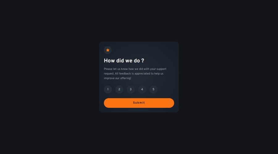
Interactive rating component
#react#tailwind-css#typescript#accessibility
P
@Fixito
Design comparison
SolutionDesign
Solution retrospective
What are you most proud of, and what would you do differently next time?
.
What challenges did you encounter, and how did you overcome them?.
What specific areas of your project would you like help with?.
Community feedback
- P@NikitaVologdinPosted 5 months ago
Hi @Fixito! Nice job!
I want to mention a few issues with the desktop version: –paddings –margins –radio inputs layout alignment
It looks sharp on the mobile version though!
0
Please log in to post a comment
Log in with GitHubJoin our Discord community
Join thousands of Frontend Mentor community members taking the challenges, sharing resources, helping each other, and chatting about all things front-end!
Join our Discord
