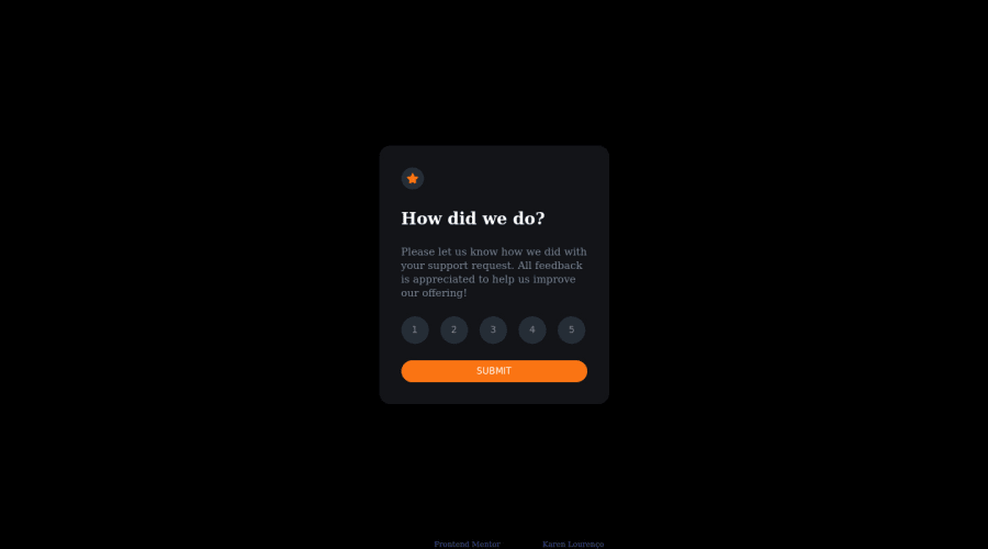
Design comparison
Solution retrospective
Is my code understandable?
Did I use the semantic HTML tags correctly, should I add more or less?
In what areas of my code can I improve on?
All feedback is greatly appreciate. It helps me to improve as a frontend developer. Thanks!
Community feedback
- @visualdennissPosted almost 2 years ago
Hey, your solution looks great! congrats on completing the challenge. JS logic also works flawless, displaying sections based css classes by manipulating DOM is a good idea, probably even better than Element.innerHTML methods. I've checked your semantic HTML as well as accessibility label, they all look correctly used to me.
Only thing i could add is that fonts seem to be missing. But that's not a big deal :)
Hope this was helpful! Keep up the great work
(P.s. thank for connecting with me on LinkedIn few minutes ago :) )
Marked as helpful0
Please log in to post a comment
Log in with GitHubJoin our Discord community
Join thousands of Frontend Mentor community members taking the challenges, sharing resources, helping each other, and chatting about all things front-end!
Join our Discord
