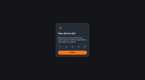
Interactive Rating Component

Solution retrospective
This is the first project that I wrote that was reviewed by others. I recently learned about the best practice generally being no set heights/widths. I mostly ended up doing that this time, with the exception of one time where I think I was essentially forced into using a set width and height. Also, this is the first time where I feel like my JS was pretty much on point. The last few, my JS felt very long and complex, this time it was short and simple. This is my first go at web accessibility so I am open to criticism on that front.
What challenges did you encounter, and how did you overcome them?This was a fairly easy challenge, and was pretty much all review. However this is my first go with no set heights/widths on the majority of elements, and that was challenging to wrap my head around at first.
What specific areas of your project would you like help with?The accessibility. I don't know what I'm doing on that front.
Please log in to post a comment
Log in with GitHubCommunity feedback
No feedback yet. Be the first to give feedback on Bart Feesley's solution.
Join our Discord community
Join thousands of Frontend Mentor community members taking the challenges, sharing resources, helping each other, and chatting about all things front-end!
Join our Discord