Design comparison
Solution retrospective
That's was my first try, I'm a beginner the trip just it's starting. Please I wanna hear your feedback
Community feedback
- @ohuttarPosted over 1 year ago
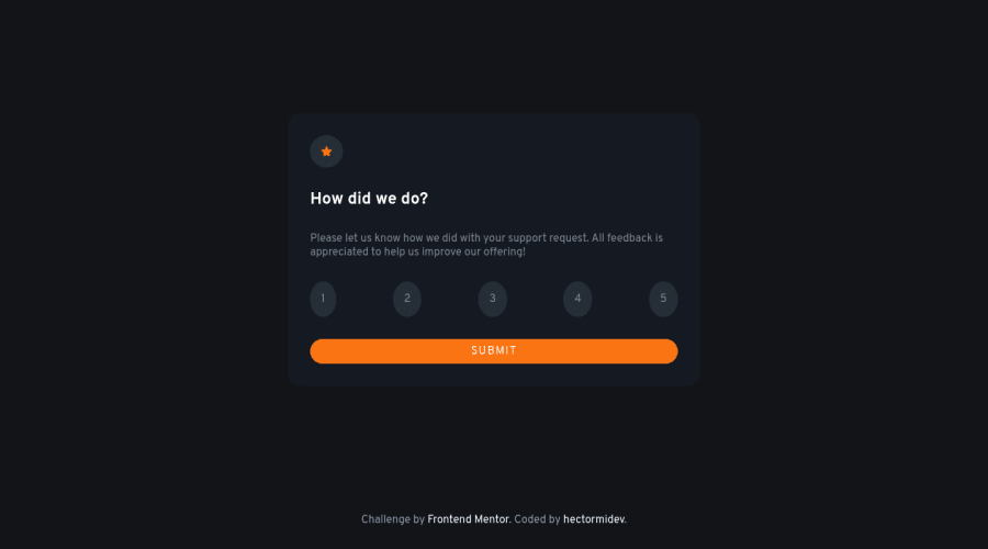
Nice solution! Your code is well-organized and easy to follow. I'm a beginner too so I can't offer a whole lot, but I did notice that your ".round" class looked more oval around the numbers. This is because you set the size of that class with padding. Since numbers are taller than they are wide, it makes an oval shape. If you set a width and height instead of padding, then they would be circles. I hope that helps!
0 - @0xabdulkhaliqPosted over 1 year ago
Hello there 👋. Congratulations on successfully completing the challenge! 🎉
- I have other recommendations regarding your code that I believe will be of great interest to you.
HTML 🏷️:
-
Use semantic elements such as
<main>fordiv class="container"to improve accessibility and organization of your page. -
Use HTML5 semantic elements such as
<header>,<nav>,<main>,<aside>, and<footer>to define these sections. -
Every site wants atleast one level-one heading, you can add a
sr-onlyclass to hide it from visual users (it will be useful for visually impaired users)
I hope you find it useful! 😄 Above all, the solution you submitted is great!
Happy coding!
0
Please log in to post a comment
Log in with GitHubJoin our Discord community
Join thousands of Frontend Mentor community members taking the challenges, sharing resources, helping each other, and chatting about all things front-end!
Join our Discord
