Design comparison
Community feedback
- @mudasirNadeemPosted 6 months ago
Semantic HTML: Good use of semantic elements! Ensure all areas use appropriate tags instead of just <div>.
Accessibility: The page is accessible, but check focus states for interactive elements and ensure color contrast meets WCAG standards.
Responsive Layout: Looks good on various screen sizes, but test on smaller devices for any overflow issues.
Code Structure: The code is readable and organized. Consider simplifying or breaking up longer sections into reusable components.
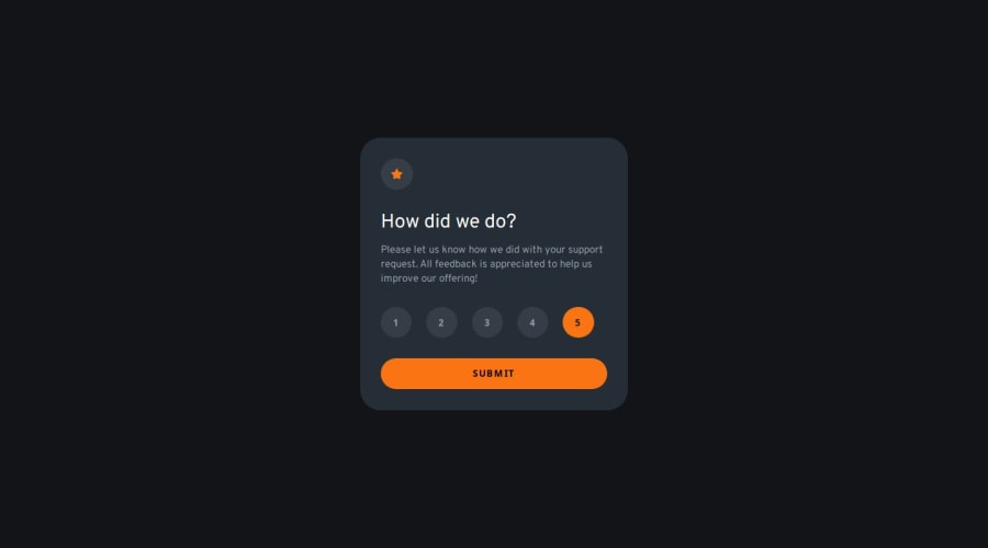
Design Consistency: The solution closely follows the design with minor deviations that don’t affect usability.
0
Please log in to post a comment
Log in with GitHubJoin our Discord community
Join thousands of Frontend Mentor community members taking the challenges, sharing resources, helping each other, and chatting about all things front-end!
Join our Discord
