Design comparison
Solution retrospective
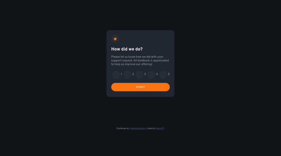
Any feedback is welcome, I couldn't get the rating buttons content to fit inside the buttons container so I let them out on the right side, I will update them as soon i get a solution.
Also i'm unsure about having two different pages of the application in the same HTML file, instead of storing them in different files. What's the best practice?
Community feedback
- @Batareika007Posted about 2 years ago
@Kevin27j
Good job for that challenge ! one of quick fix, maybe not perfect one but it will work and put rating inside button. you can put it all inside
labeland then wrap the "1" insidespan<label for="btn-1" class="rating-value"> <input type="radio" name="rating" id="btn-1" class="rating-btn" value="1" placeholder="1"> <span>1</span> </label>add some CSS to
labelandspanand it will be in the center..rating-value{ position: relative; } .rating-value span{ position: absolute; left: 50%; top: 50%; transform: translate(-50%, -50%); }of course you can change color and add some animation... for now on click the number will be not seen because the same color , but you can change it, you will figure out how to do this =)
about second question, I don't see something wrong with that. I think when you will go with frameworks you will learn new ways how to do that, for now I think it's fine.
hope it will help.
1
Please log in to post a comment
Log in with GitHubJoin our Discord community
Join thousands of Frontend Mentor community members taking the challenges, sharing resources, helping each other, and chatting about all things front-end!
Join our Discord
