

Design comparison
SolutionDesign

Solution retrospective
Hi Guys, Please I want you to check and give me feedback. Tips on best practices.
Community feedback
- @tesla-ambassadorPosted almost 3 years ago
Hey David! This is a great solution, kudos to completing the challenge! 😎 Here's a few pointers you could use:
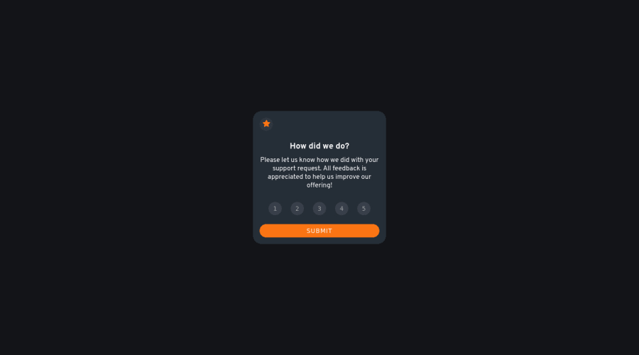
- I think you should make the card and it's components a little bigger for easier readability cause they are very small at the moment. Maybe you could try a width of 400px and a hieght of 400px to be on scale relative to the width. Then you can resize your internal components to also scale relative to the card they are contained in.
- You could add the
aria-labelproperty and set it tostar icon buttonto your button incase you were not going to add text because the browser needs to identify what button that is and it also helps those using screen readers. Your button should look like this<button aria-label = "star icon button"> <svg><path></path></svg></button>That will resolve some of your accessibility issues. - In order to resolve some of your accessibility issues, you might wanna use landmarks in your html code, these help browsers easily navigate your code. So you might consider wrapping your divs in landmarks like
<main>or<header>or<footer>you need to do this according to how your page is structured. Incase you want to know more about landmarks, follow this link.
Happy coding and keep up the good work👍
Marked as helpful1@DaveamegsPosted almost 3 years ago@tesla-ambassador Thank you so much for your feedback. I really appreciate it. and it is a helpful one too especially the link you posted. Thanks once again
1

Please log in to post a comment
Log in with GitHubJoin our Discord community
Join thousands of Frontend Mentor community members taking the challenges, sharing resources, helping each other, and chatting about all things front-end!
Join our Discord