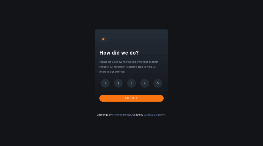
Design comparison
Community feedback
- @jakubjirousPosted about 2 years ago
Hi Jasenko,
Overall, the code provided for the Interactive Rating Component looks well-structured and easy to read. The HTML and CSS follow best practices, such as using semantic HTML elements and using CSS variables to define colors. However, there are a few potential areas for improvement that could be addressed to further enhance the code.
1) Accessibility – The rating buttons are currently represented using
buttonelements, which is good practice. However, there are no visible labels associated with each button to describe their purpose to screen readers. Consider usingaria-labelattributes to provide accessibility for users who rely on assistive technology.2) Inline Styles – In the HTML code, the span element with ID
ratinghas inline styles applied to it. It is generally considered better practice to use a separate CSS file and apply styles there rather than inline styles.3) CSS Import – The CSS file is being imported using an
@importrule in the CSS code. This can slow down page load times as it requires an extra HTTP request. Consider using the<link>tag in the HTML file instead to load the CSS file.4) Focus styles – The code uses a focus style for the submit button but not for the rating buttons. Including a focus style for the rating buttons can improve the user experience for keyboard users.
You did an excellent job in addition to that!
Cheers, Jakub
Marked as helpful0
Please log in to post a comment
Log in with GitHubJoin our Discord community
Join thousands of Frontend Mentor community members taking the challenges, sharing resources, helping each other, and chatting about all things front-end!
Join our Discord
