Design comparison
SolutionDesign
Solution retrospective
Any tips on how I can improve are welcome :)
Community feedback
- @grace-snowPosted over 1 year ago
Hi
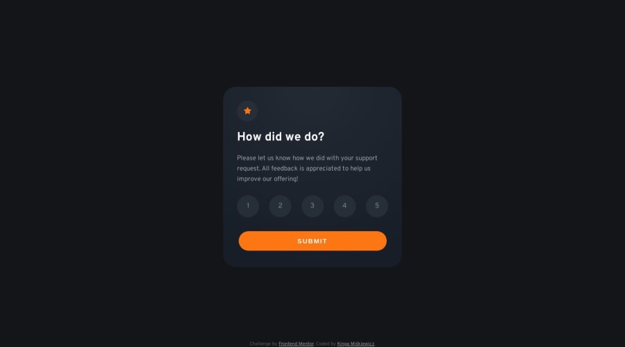
I'm afraid you need to change the html in this. It must be a form with a fieldset of radio inputs. Any other markup for this design poses significant accessibility issues
Once that is done you'd need to
- update styling to accessibly hide the inputs and ensure focus visible and checked states work for keyboard users
- update js to only listen for a form submit. The form should not submit until a required radio has been checked
To make this fully accessible there is more to consider as well but that should be enough to get you started
Additionally
- this is currently overflowing my mobile screen on the sides because you've set width not max-width
- the card must not have a height. Never limit the height of text containing elements
- the button should not have an explicit height or width either. Use padding and width 100%.
- the alt on decorative images should be left blank (eg the star)
- I strongly advise against setting html font size to 62.5% like you are doing now. Have a read of this to understand why it can be really terrible and how to handle rems better
- also on my site is a post about why font size and line height must never be in px. Worth you reading that one as well
I hope all of this helps
Marked as helpful1@codingbearyPosted over 1 year ago@grace-snow Thank you, this is very helpful! I'll make the changes in my free time!
0
Please log in to post a comment
Log in with GitHubJoin our Discord community
Join thousands of Frontend Mentor community members taking the challenges, sharing resources, helping each other, and chatting about all things front-end!
Join our Discord
