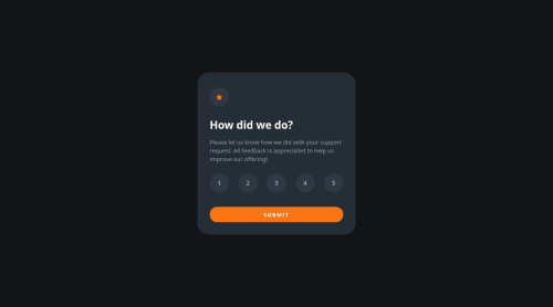
Design comparison
Solution retrospective
Hi, I'm Sakti, This is my solution in this challenge.
This is fun project to practice handling user interaction. And try to make it as similar to the design as possible
Build, function or package i use:
š Nuxt.Js
- This project was installed using Nuxt.js v3.9.0
š Vue.js Some of the functions from Vue.js that I use in this project are :
- @click
- v-for,
- v-if,
- ref variables
š HTML
- Semantic Tags
š Sass/Scss
- Sass/Scss Variables
- CSS Flexbox
- CSS Animation with keyframes
- CSS Media Queries
- CSS Transitions
- etc.
š Sweetalert2 v11.10.3
- Another library or packages for nice & easy to makes alert or message box
Any tips, comments & suggestion are welcome
Community feedback
- @grace-snowPosted 10 months ago
I'm afraid you need to rewrite all of the markup in this.
You need to
- remove all of the nested sections and article.
- remove the figure. You only use that when needing a figcaption
- leave the alt blank on decorative images
- remove the nav
- use a form (essential)
- use a fieldset of radio inputs (essential)
- use a visually hidden legend for the fieldset
- use aria-live or focus management to move focus to the thank you panel on successful submit
Once you've fixed all of this you will need to rewrite the js as well to ensure proper handling of the form data.
In the css
- it is less performant to load fonts via css imports. You would be better doing this in the head
- font size and line height must never be in px
- the component max width must be in rem
- you should not be deep nesting selectors like this. Even in scoped styles it can create specificity headaches and be far too tied to element selectors. Here is a post about sass nesting that may be of benefit
- some of the units in this should not be px eg width and height of radios
- outline none on interactive elements is an immediate and critical accessibility failure. It breaks sites for keyboard and assistive tech users.
- you must not set heights on components that contain text
I recommend you read some more about responsive layout and media queries in general
Marked as helpful1@saktiajadehPosted 10 months agoHi @grace-snow, Im happy to your suggestions to improve my work for get better result.
Thanks for the feedback
I am grateful that by taking part in this challenge I realized that I still need to learn a lot in implementing design and other things in any aspect needed for improvement.
0@grace-snowPosted 10 months ago@saktiajadeh it's really all about forms in this. Correct markup in particular is essential for accessibility. These are critical issues that need fixing. It's unusable for many at the moment.
This is partly why we recommend projects are done in vanilla tech before learning frameworks.
Marked as helpful0
Please log in to post a comment
Log in with GitHubJoin our Discord community
Join thousands of Frontend Mentor community members taking the challenges, sharing resources, helping each other, and chatting about all things front-end!
Join our Discord