Design comparison
Solution retrospective
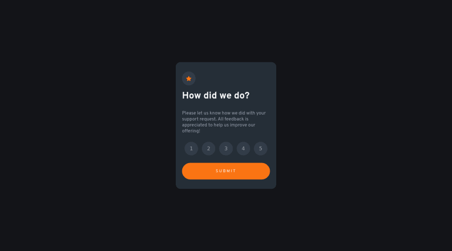
Check out this interactive rating component I made! Built with the classic trio: HTML/CSS/JavaScript.
Please log in to post a comment
Log in with GitHubCommunity feedback
- Account deleted
Hey there! 👋 Here is some feedback to further improve your code:
- Every site should ALWAYS have ✅ a
mainelement not only for semantic purposes but also to help assistive technology find the main content of your content. For this challenge, it will serves as the component’s container ⚠️.
More Info: 📚
- ⚠️ All images, illustrations, icons, etc… should always have an
alt tag(regardless if they are decorative or not) to help improve the accessibility of your content.
- The HTML for the ratings needs to be rewritten as it was done incorrectly ❌:
To ensure that the "rating buttons" are fully accessible 💯, they need to be built using a
form⚠️.- Everything will be wrapped inside a
fieldsetwhich will have alegendthat is visually hidden using CSS. - Inside, there should be five
input radiosand eachinputshould have alabelattached to it to make the “ratings” accessible. - The last thing you will want to include will be a
buttonso users can submit their choice.
More Info: 📚
- Once the top is implemented , for your JS, the
eventListenershould be on theform⚠️ as asubmit.
More Info:📚
Click vs. Submit EventListeners
If you have any questions or need further clarification, you can always check out my submission and/or feel free to reach out to me.
Happy Coding! 🤖
Marked as helpful - Every site should ALWAYS have ✅ a
Join our Discord community
Join thousands of Frontend Mentor community members taking the challenges, sharing resources, helping each other, and chatting about all things front-end!
Join our Discord
