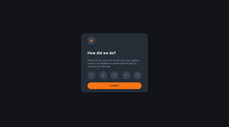
Design comparison
SolutionDesign
Solution retrospective
What are you most proud of, and what would you do differently next time?
Adding accessibility and semantic HTML5 is what I am most proud of.
I can submit another solution using React and tailwindcss.
there are no tough challenges that I face in this challenge but I have a little challenge which is adding an active state and removing from other children I searched a lot and finally, I found the solution in the poe.com.
I think I covered the most areas in that challenge, so I can't think of any places where I need help.
Community feedback
Please log in to post a comment
Log in with GitHubJoin our Discord community
Join thousands of Frontend Mentor community members taking the challenges, sharing resources, helping each other, and chatting about all things front-end!
Join our Discord
