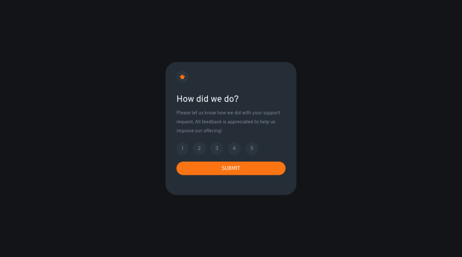
Design comparison
Solution retrospective
Thanks for checking out my second Project!
Is there any way that I can go about making my code cleaner?
How can I improve my code for upcoming projects?
Is everything easy to read and understandable? What would you do differently from my code?
Thanks for your feedback, I really appreciate it! :)
Community feedback
- Account deleted
Hey there! 👋 Here is some feedback to further improve your code:
- The “icons/illustrations” in this component are purely decorative. ⚠️ Their
alt tagshould be left blank to hide them from assistive technology.
More Info:📚
https://www.w3.org/WAI/tutorials/images/
- The HTML for the ratings needs to be rewritten as it was done incorrectly ❌:
To ensure that the "rating buttons" are fully accessible 💯, they need to be built using a
form⚠️.- Everything will be wrapped inside a
fieldsetwhich will have alegendthat is visually hidden using CSS. - Inside, there should be five
input radiosand eachinputshould have alabelattached to it to make the “ratings” accessible. - The last thing you will want to include will be a
buttonso users can submit their choice.
Here is how it looks like fully implemented: EXAMPLE
More Info: 📚
- Once the top is implemented , for your JS, the
eventListenershould be on theform⚠️ as asubmit.
More Info:📚
Click vs. Submit EventListeners
If you have any questions or need further clarification, you can always check out my submission and/or feel free to reach out to me.
Happy Coding! 😈
Marked as helpful1@CodingTimmyethPosted about 2 years ago@vcarames hey, I'm currently looking at your code and I have a question about why you did this?
<h1 class="visually-hidden">Interative Rating Component</h1>0Account deleted@CodingTimmyeth
It is not necessary to add that line of code (for components) but it is good practice when wanting to skip heading levels, since headings are sometimes visually hidden.
0 - The “icons/illustrations” in this component are purely decorative. ⚠️ Their
- @CodingTimmyethPosted about 2 years ago
One more, thing I had trouble with the media queries that's why my front page likes small and tight. How can I improve on that?
Thanks again!
0
Please log in to post a comment
Log in with GitHubJoin our Discord community
Join thousands of Frontend Mentor community members taking the challenges, sharing resources, helping each other, and chatting about all things front-end!
Join our Discord
