Design comparison
SolutionDesign
Solution retrospective
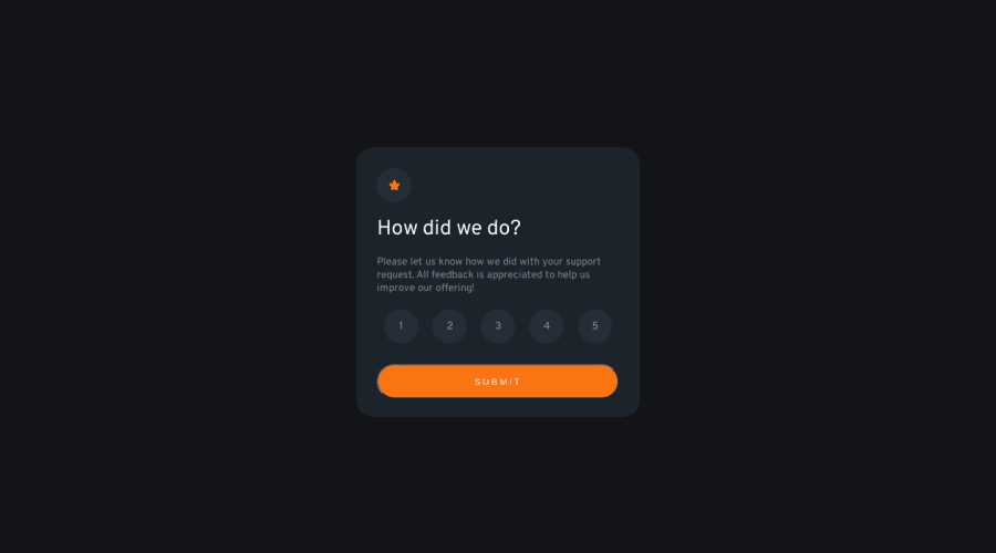
This is my second JavaScript project. Please let me know what I could improve, as I want to get better
Community feedback
- @PastequeMurePosted over 1 year ago
Looks Great !
Two thing. In my opinion
    cursor: default;
    background-color: hsl(217, 12%, 63%);
    color: white;
} ```

add cursor : default when active

And

```#przycisk {
    border: 0;
    width: 100%;
    border-radius: 40px;
    height: 50px;
    margin-top: 30px;
    color: hsl(0, 0%, 100%);
    letter-spacing: 3px;
    background-color: hsl(25, 97%, 53%);
    cursor: pointer;
}```
Add border : 0 to your submit button

Overall well done. It's a huge job :D
Marked as helpful0
Please log in to post a comment
Log in with GitHubJoin our Discord community
Join thousands of Frontend Mentor community members taking the challenges, sharing resources, helping each other, and chatting about all things front-end!
Join our Discord
