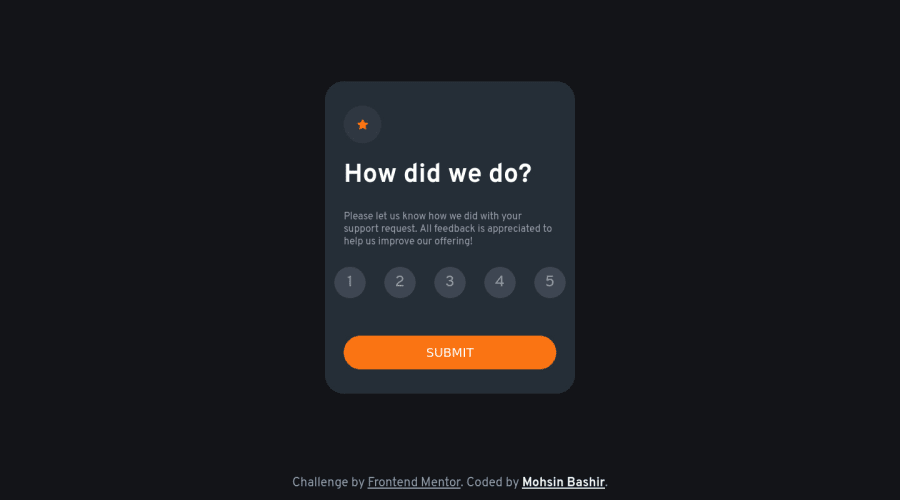
Design comparison
Solution retrospective
I learned a lot from this project especially the active button I saw a lot of solutions for this project but most of them doesn't implement an active button but hopefully, I did after hours of confusing, and research finally I solve that with HTML RADIO buttons check it out. All feedback are welcoming 🙏 have a nice day
Community feedback
- @darryncodesPosted over 2 years ago
Hi Mohsin,
Really nice work on this challenge, well done.
And great perseverance to complete the solution with radio buttons too!
Some considerations for you:
- check out a <fieldset> for your
.rating-container
. It is a semantic element to choose compared to adiv
and has some interesting attributes you might use in the future - you should consider adding
cursor: pointer;
to your interactive elements to give that additional feedback to the user on desktop - also it'd be great to see some focus states added to those interactive elements for those who navigate the component using a keyboard
- your accessibility report is suggesting you need to use a landmark element like a
<main>
, here is some more information for you - lastly you could consider making the card and thank you result the same dimensions, so when it changes you don't notice a difference between the layouts as much
Overall you smashed it, with a few tweaks you could level it up even further!
All the best!
1@mobasher10Posted over 2 years ago@darryncodes thanks bro for your feedback I will try these suggestions in my next challenges
0 - check out a <fieldset> for your
Please log in to post a comment
Log in with GitHubJoin our Discord community
Join thousands of Frontend Mentor community members taking the challenges, sharing resources, helping each other, and chatting about all things front-end!
Join our Discord