Design comparison
Solution retrospective
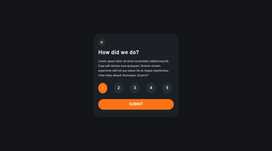
The interactive component challenge completed... i think. If there's anything that can be improved, please tell me.
Community feedback
- @danyczechPosted almost 2 years ago
I like your solution with radio buttons and the second button to get back to the first card!
Just in your HTML part, the submit button after the radio buttons is missing, and instead of it is an <a href="#" id="submit" class="main--btn">submit</a> tag. It makes no sense there... It would be better to use this:
<div>
      <button type="submit">Submit</button>
</div>
Also using <form> and <fieldset> elements would be better, more there
And a minor thing - the color of the texts in <p> tags and inside marking buttons are not white, but grey.
Marked as helpful1 - Account deleted
Limit the usage of divs. Instead use tags like header, main, aside, footer and section. They provide more semantic meaning to your code.
Marked as helpful1
Please log in to post a comment
Log in with GitHubJoin our Discord community
Join thousands of Frontend Mentor community members taking the challenges, sharing resources, helping each other, and chatting about all things front-end!
Join our Discord
