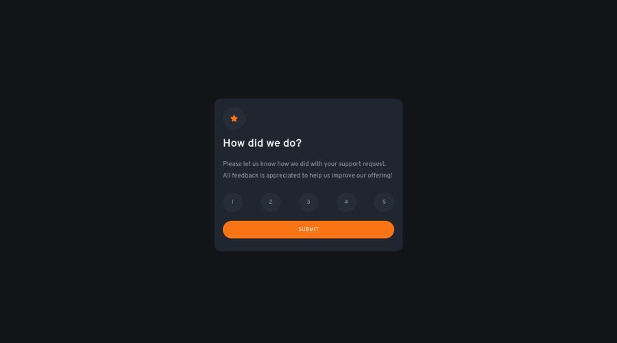
Design comparison
Solution retrospective
My third project here, and the first one with JavaScript!
Cannot say that I feel fluent in js at all yet, but it is so much fun when your can add new functionality!
Community feedback
- @aUnicornDevPosted about 2 years ago
Hi Veronica,
Great solution π₯π₯!!!
Just a few points...
The selected rating does not go back to normal when I select another rating. You can do this by removing the "selected" class from all the buttons first, and then adding the "selected" class on the clicked element.
The hover on Rating does not change the font color to white.
0@veronisabPosted about 2 years ago@aUnicornDev Thank you for your comment, that is super helpful!
Didn't really realise that the selected stayed - I'll look into that!
Now, I have just fixed the text color on hover.
1
Please log in to post a comment
Log in with GitHubJoin our Discord community
Join thousands of Frontend Mentor community members taking the challenges, sharing resources, helping each other, and chatting about all things front-end!
Join our Discord