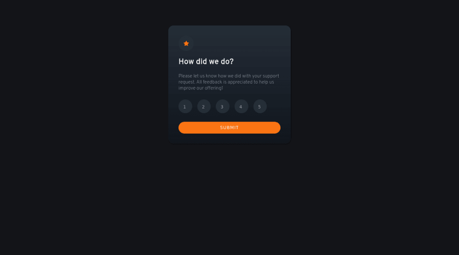
Design comparison
Solution retrospective
Please tell me if my project is wrong and have the another solution method. Thanks!
Community feedback
- @icaroMendes777Posted about 2 years ago
Hello!
if I can point improvements:
-you can align the buttons better with flexbox. But no Hurry, it may take some time to learn it. Flexbox is one of the best tools in css for align things perfectly, once you have learned it, make symmetrical designs will be far easier. (this includes to center the rating box in the middle of the screen too!)
-Maybe it was not very clear in the template offered, but once you choose a rating, that number changes its color, so that the selected number is different from the others.
but in general is looking good, keep doing it!
0 - @gauravsingh1281Posted about 2 years ago
Hii , Instead of using form input type="radio" for rating section you can create 5 divs and position them with CSS display flex property.
you can also go through my solution - https://gauravsingh1281.github.io/Frontend-Mentor-Interactive-rating-component/
0@miranleginPosted about 2 years ago@gauravsingh1281
Hi Gaurav, can you please elaborate why would it be better to use div's instead of input's like in Mumtaz's solution?
Cheers, Miran
0@MumtazTechPosted about 2 years ago@gauravsingh1281 yes but my radio automatically flex.
0
Please log in to post a comment
Log in with GitHubJoin our Discord community
Join thousands of Frontend Mentor community members taking the challenges, sharing resources, helping each other, and chatting about all things front-end!
Join our Discord
