INTERACTIVE RATING COMP 🎯 [ ACCESSIBLE - BEM - VANILLA CSS3 - ES6 ]
Design comparison
Solution retrospective
👾 Hello, Frontend Mentor Community,
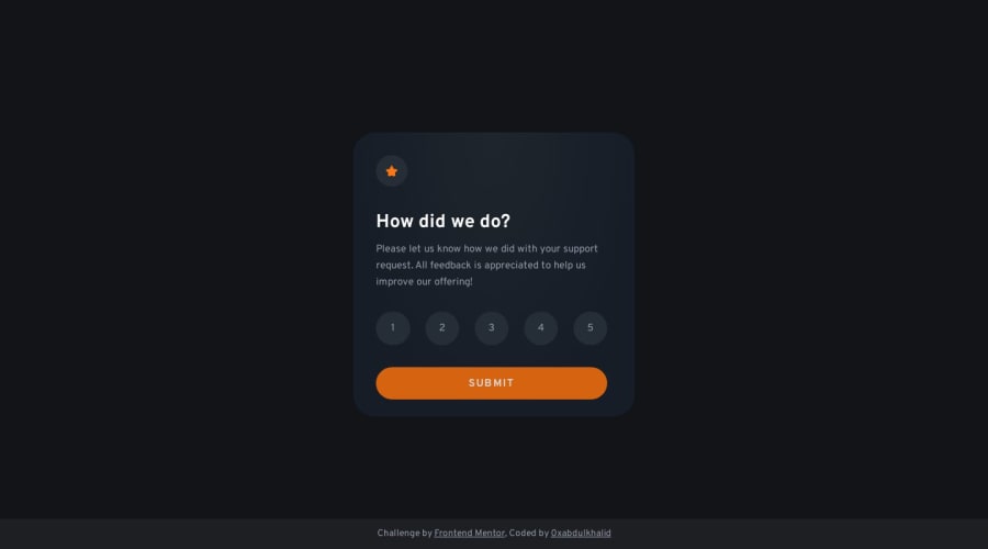
This is my solution for the Interactive Rating Component.
100%Accessible solution withformintegration, you check by pressingtabkey along with←&→to traverse your rating selection finally hitenterto submit your result- Learned the usage of
fieldset,legend, &radioinput elements to build well accessible form - Scored
99.5%on Google Pagespeed Insights! 🤩 - Actually it's been overwhelmed at this part because of performance issues. So i injected the
cssandjsinside thehtmlfile itself to improve site performance. results86%=>99.5%🚀 - Used
Prettiercode formatter to ensure unified code format ⚙️ - Layout was built responsive via mobile first workflow approach 📲
- Had a lots of fun while building this challenge ! 🤠
- Feel free to leave any feedback and help me to improve my solution 💡
.
👨🔬 Follow me in my journey to finish all newbie challenges to explore solutions with custom features and tweaks
Ill be happy to hear any feedback and advice !
Community feedback
- P@visualdennissPosted almost 2 years ago
Feels elegant and smooth. Great job with it. Only a minor detail, which i've believe you have forgotten is to add cursor: pointer; to the hover states of radio btns to indicate user that they are interactive elements. Keep up the good work!
Marked as helpful1@0xabdulkhaliqPosted almost 2 years agoGlad you come up with an acceptable suggestion @visualdenniss!
- I just already applied
cursor: pointerfor thediv, but seems it's not working so i tried to add thecursorfor the label itself it gonna work
- Once again thank you mate!
0P@visualdennissPosted almost 2 years ago@0xAbdulKhalid Happy to hear it was something useful!
That's a really strange issue and more complex than i thought. I'm not so familiar with radio buttons, but when i tested it on the dev tools now adding cursor:pointer; for only label itself works only with the selected button. 🤔
0@0xabdulkhaliqPosted almost 2 years agoI'm also experiencing something weird here @visualdenniss,
- I updated the css code with
cursor: pointerfor thelabelelements to get the job done - But the issue is the deployed site has not been updated yet, but the workflow has successfully run after editing the code
- I wonder why this weird thing is happening 😂
0 - I just already applied
- Account deleted
This comment was deleted almost 2 years ago
1@0xabdulkhaliqPosted almost 2 years agoGlad to receive suggestion from you @MrSandipSharma!
- Can you tell, in what mobile device you tested this site ?
- So that i can also test the site according to the device screen size for simulation and test it for sure
0 - @CornflakesPlusPosted almost 2 years ago
Great job! Abdul Khaliq.
Nice and clean code, nice Read Me structure as well. For the Screen Reader Only file (
sr_only), the CSS you used is a general copy-paste? Also, how did you get the badges in the Read Me file?0@0xabdulkhaliqPosted almost 2 years agoBro @CornflakesPlus,
- I can't understand what you're asking, the css using for
sr_onlyclass is crafted with care because if anything misses then thesr_onlyelement will fail to work as intendend. So every solution will consists the samesr_onlystyles (they are crafted by accessibility experts)
- And next, the badges for the
README.mdfile is not available, because it was manually build by developers like us.
- We want to use
badge.ioapi and any icons you wish fromsimpleiconsjust merge them and see the action
Hope am helpful!
1 - I can't understand what you're asking, the css using for
Please log in to post a comment
Log in with GitHubJoin our Discord community
Join thousands of Frontend Mentor community members taking the challenges, sharing resources, helping each other, and chatting about all things front-end!
Join our Discord
