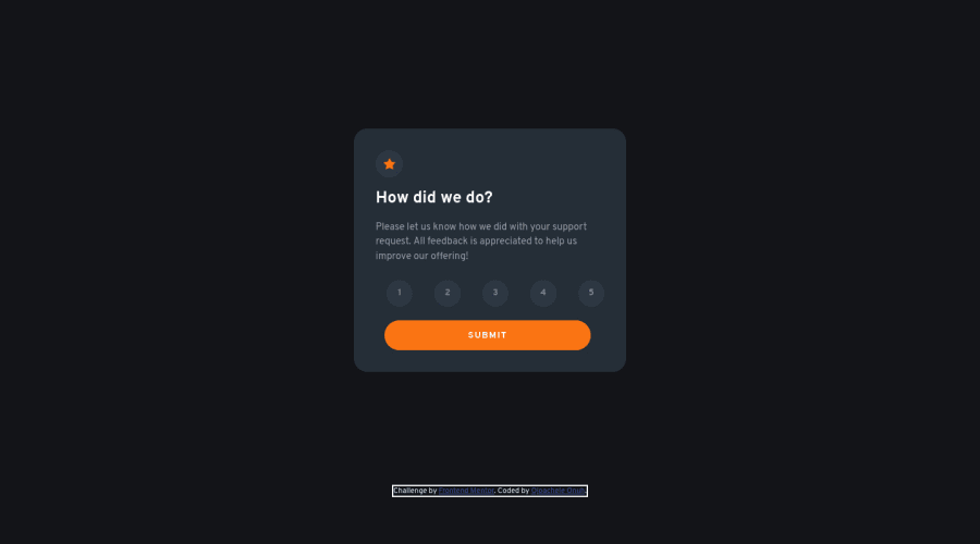
Design comparison
SolutionDesign
Community feedback
- @romila2003Posted about 2 years ago
Hi Ojoachele,
Congratulations 🎉 for completing this challenge, it was a great attempt however there are some issues regarding your HTML and CSS:
- It is best great that you used the
footertag for the footer however it is best practice to wrap your code within themaintag which would ensure that your content is wrapped within the correct landmarks e.g.<main class="container"></main> - You should give the buttons, the cursor property of pointer e.g.
cursor: pointer; - Since this project does not revolve heavily around responsiveness and changing the layout as you increase the screen size, it is not necessary to add a media query. Therefore, instead of giving your card a width of 70% in mobile screen, you can write 100% instead and remove the margin property within the media queries too since the card is already centred in the middle.
- Also, I would encourage you to set the
max-widthproperty to400pxand then give your body apaddingof0 20pxso that the card does not touch the side.
Overall, great attempt and wish you the best for your future projects so keep coding 👍.
1 - It is best great that you used the
Please log in to post a comment
Log in with GitHubJoin our Discord community
Join thousands of Frontend Mentor community members taking the challenges, sharing resources, helping each other, and chatting about all things front-end!
Join our Discord

