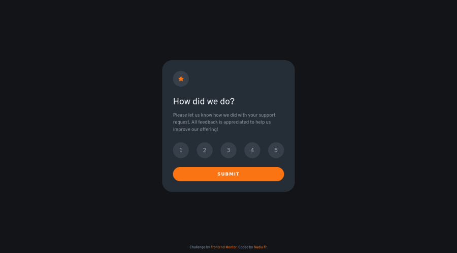
Interactive rating card component, for desktop 1440px and mobile 375px
Design comparison
Solution retrospective
OMG! That's my first ever JS component made just by myself. For now I dont care much if the code is "clean", I'm just proud of myself it WORKS!
Community feedback
- @besttlookkPosted over 2 years ago
Hi, Congratulations on completing the challenge. Keep up the good work. W.r.t functionailty everythings looks great. just need some design imporments, like:
- Numbers are bit aprrt from each other. Decreasing the width of the card will help.
- Footer is too much at the bottom , also it is too small.
Good luck, Happy coding
1@NadiaFrShLmPosted over 2 years ago@besttlookk Thanks for your feed back. Since my first challenge here I ask myself the same questions:
Like your noticed, numbers are appart, but I tried to match the given design (made for 1440px), that means on the screen resolution more than 1440 that would be stretched.
How could I make it similar without media queries? Looks like my approach doesn't work , I add max-with: 1440px to the body.
0@besttlookkPosted over 2 years ago@NadiaFrShLm I dont think you need media-quiery for the box size. Just do this:
box{
  width:90vw;
  max-width:420px // adjuest this according to your need
  margin: 0 auto
}
I hope this helped. In case you have other query do let me know. I am no expert but i will try to help you out .
Happy Coding
Marked as helpful1 - @correlucasPosted about 2 years ago
👾Hello Nadia, Congratulations on completing this challenge!
Great code and great solution! I’ve few suggestions for you that you can consider adding to your code:
1.Add transitions to make the interaction smoother while the element gets hovered, you can use a value like
transition: all ease-in 0.5s.2.To improve the card overall responsibility, you can start to add
flex-wrapinside the class that manages the section for therating numbers buttonand makes the adjust to fit in different rows while the container scales down, not that without this property the container doesn't shrink. Here's the code applying these changes:.raiting { display: flex; justify-content: space-between; flex-wrap: wrap; }✌️ I hope this helps you and happy coding!
0
Please log in to post a comment
Log in with GitHubJoin our Discord community
Join thousands of Frontend Mentor community members taking the challenges, sharing resources, helping each other, and chatting about all things front-end!
Join our Discord
