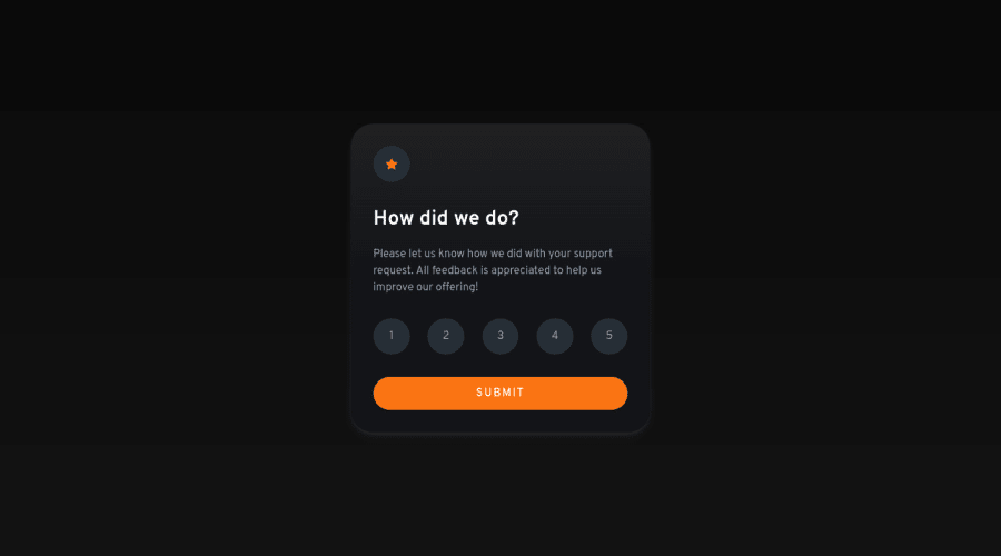
Design comparison
Solution retrospective
Hi there! I made another challenge!
The only thing that was a issue for me was setting up the semantic html, what would make sense and what wouldn't, could you guys guide me?
I'm trying to do all newbies projects in vanilla html/css/js from now on, it's a wonderful experience! I tried to use somethings that i learned recently, like animations done with pure javascript, little hacks with custom proprieties in css, etc... so i've made some changes to the original design, hope you like it!
Community feedback
- @hyrongennikePosted about 2 years ago
Hi @Lukiticas,
Congratulations on finishing another project it look great!
One thing I picked up on is when you click on submit and go to the thank you card you can click anywhere to go back but there's text says "click to go back" that looks like a link not sure if that was your intentions just I thought it was broken at first so to improve the UX maybe just make that text a clickable button.
Marked as helpful1@LukiticasPosted about 2 years ago@hyrongennike Thank you for the feedback!
I tried to make the whole thank you card as a button, so if you click again in the card you would go back. But it isn't the most UX way to do, is it? Should i make a proper button then?
1@hyrongennikePosted about 2 years ago@Lukiticas yes you can either make it look like a button or just have the text "Go Back" with a arrow icon and add hover state so the user knows it's clickable.
I like the shake animation you added on submit.
1@LukiticasPosted about 2 years ago@hyrongennike Just added something like that you described! Let me know if i did it right!
1
Please log in to post a comment
Log in with GitHubJoin our Discord community
Join thousands of Frontend Mentor community members taking the challenges, sharing resources, helping each other, and chatting about all things front-end!
Join our Discord
