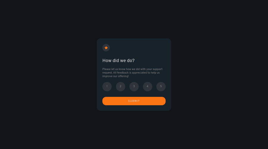
Design comparison
Solution retrospective
the difficulty is not familiar with form(input radio),and it Dom manipulation, second one is about layout, can not make the second card being hidden, I put the hidden class on it but still can not hide it.
Community feedback
- @VCaramesPosted almost 2 years ago
Hey there! 👋 Here is some feedback to further improve your code:
- It is best practice ✅ to have separate files for you coding files (HTML, CSS, JS). It helps keep things organized and make it easier to maintain.
- The
sectionandheaderelement is being used incorrectly ⚠️ and not needed for this challenge.
- The “icons/illustrations” in this component are purely decorative. ⚠️ Their
alt tagshould be left blank to hide them from assistive technology.
More Info:📚
https://www.w3.org/WAI/tutorials/images/
- Your
formis lacking 😢 a visually hiddenlegendfor accessibility and afieldsetto improve semantics.
More Info: 📚
- NEVER ❌⚠️⚠️ do this as it creates accessibility issues for users and it is outdated, instead download a
pxtorem/emconverter in your code editor.
html {
  font-size: 62.5%;
}
More Info:📚
Should I change the default HTML font-size to 62.5%?
If you have any questions or need further clarification, you can always check out my submission and/or feel free to reach out to me.
Happy Coding! 👾
Marked as helpful0@TianYeCalPosted almost 2 years ago@vcarames Thank you! it's so helpful for me, thanks for the help! I'll look up of all these advices!
0
Please log in to post a comment
Log in with GitHubJoin our Discord community
Join thousands of Frontend Mentor community members taking the challenges, sharing resources, helping each other, and chatting about all things front-end!
Join our Discord
