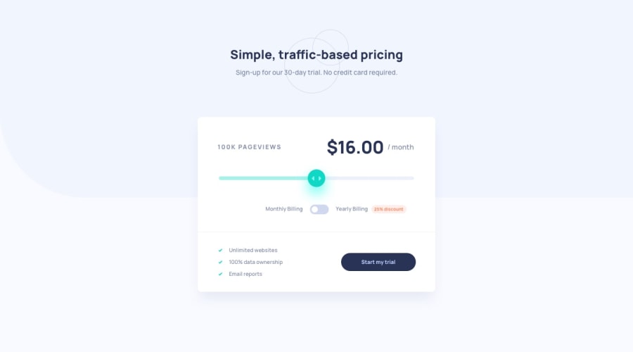
Design comparison
SolutionDesign
Solution retrospective
Any feedback is welcome
Community feedback
- Account deleted
Hi there 👋
Congratulate on finishing your project 🎉. You did a great job 💡
I give some suggestions to help you take your project design to the next level 📈😉
- About the color of the button, it should be white default and change to darker on hover, which you did the opposite
- Let's change the line color to
#ECF0F8also
Happy coding ☕
Maqsud
Marked as helpful1 - @optimusprime202Posted almost 3 years ago
Hey @yuenu, This was first class work.
1
Please log in to post a comment
Log in with GitHubJoin our Discord community
Join thousands of Frontend Mentor community members taking the challenges, sharing resources, helping each other, and chatting about all things front-end!
Join our Discord
