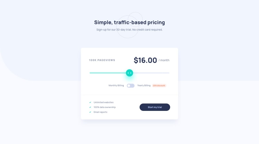
Design comparison
SolutionDesign
Solution retrospective
Any suggestions would be appreciated!
Community feedback
- @pikapikamartPosted about 3 years ago
Hey, awesome work on this one. Layout in general seems fine but the main layout needs the
box-shadowto be adjusted like smooth and have some rounded-corners.Some other suggestions would be:
- The pricing of the component could use a heading tag, since primarily it serves as the pricing label for the whole form or component.
- The slider needs to be an
inputto be used properly. Usingdivis not accessible at all, only mouse is the peripheral that can interact with it. Remember, an interactive component needs to use interactive element. - Same goes for the billing section, it should have used
input, those text on the left and right side of it are thelabelfor theinputelement. Take a look at my solution on this one forgive me about the lack ofmainelement, this solution I made was very long ago and I haven't exactly know much before. But look at the structure of it, also in my billing section, I could have usedfieldsetalong with alegendto make it more accessible. - But really, making the component a
formelement would be really great, so that you are like simulating a real app. Thebuttonas well should havetype="submit"because that will submit theform.
Aside from those, great work again on this one.
Marked as helpful0@ttakeyayaPosted about 3 years ago@pikamart
I've never thought about making the component with form. I didn't realize the importance of the accessibility. I'll tweak the code.
I appreciate your suggestions!
0
Please log in to post a comment
Log in with GitHubJoin our Discord community
Join thousands of Frontend Mentor community members taking the challenges, sharing resources, helping each other, and chatting about all things front-end!
Join our Discord
