
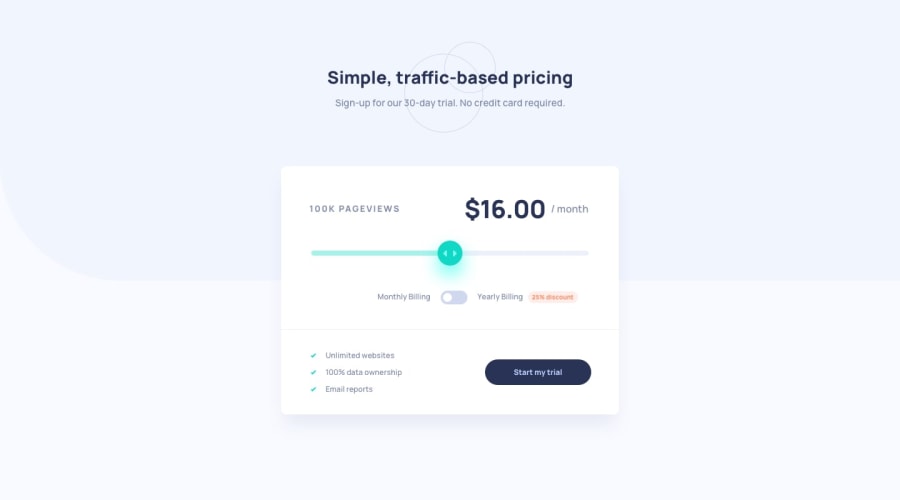
Interactive Pricing Component with SASS and vanilla JS


Design comparison
Solution retrospective
Feedback on mobile layout will be helpful. <br> Edit - Some features may not display properly in non-webkit browsers. Try opening the site in chrome if it is not displayed properly. Suggestions for cross-browser compatibility are also welcome.
Community feedback
- @AgataLiberskaPosted over 3 years ago
Hi @PraneetDixit is there anything in particular about mobile layout that you want feedback on? The layout itself looks good to me, I would just ad some padding on the sides of the heading and the tagline, because on smaller screens they stretch right to the edges of the viewport.
I can't help you with other browsers, unfortunately, sorry!
But, I think you should reconsider how you use the heading elements. You should only have one
<h1>on the page, and all the rest should be actual heading sections, and make sense in the hierarchy of the page (think of it this way - you should be able to create a table of contents of the page based on the heading elements). Does this make sense? Let me know!0

Please log in to post a comment
Log in with GitHubJoin our Discord community
Join thousands of Frontend Mentor community members taking the challenges, sharing resources, helping each other, and chatting about all things front-end!
Join our Discord