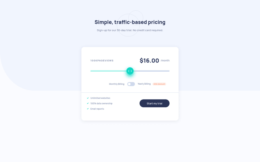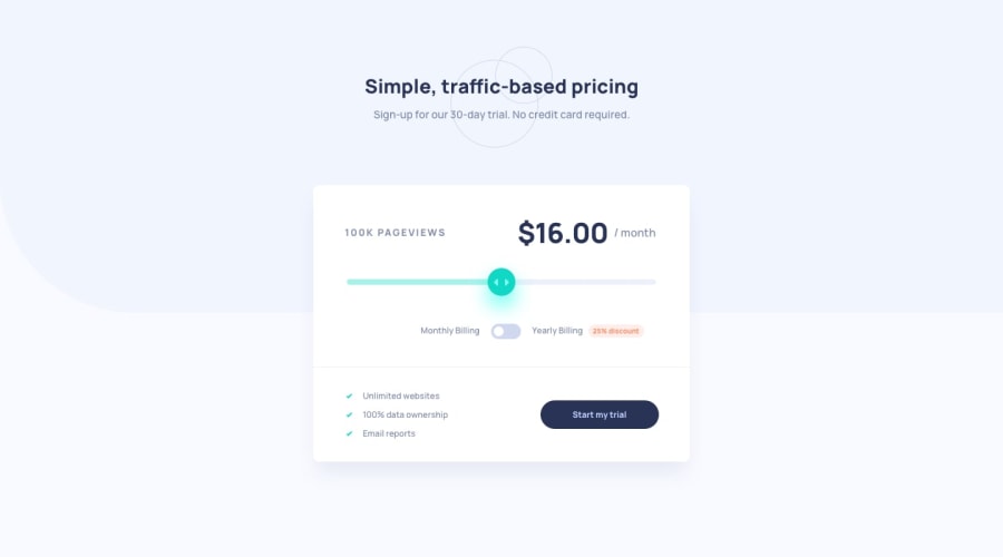
Interactive pricing component using HTML CSS Js Mobile-first workflow
Design comparison
Solution retrospective
Hello community, I have completed another frontend mentor challenge, I took me more than I expected.
1- I struggled with how to change the input [type="range"] value using JavaScript , then it will submitted in the form. If anyone have any suggestion, please leave a comment.
2- How to improve accessibility? Especially , the switch button.
I'd appreciate any comments for improvements or anything I've missed in JavaScript , the way I used the functions . Thank you in advance.
Community feedback
- @Kehinde-AgboolaPosted over 2 years ago
Hey, Man Welldone!. I love the responsiveness.
1 - @YosityPosted over 2 years ago
Good job man this challenge's cool I just wanna let you know that when I click on the "Monthly/Yearly Billing" the thingy between them activates so fixing that would make it definitely better :)
1@PhoenixDev22Posted over 2 years ago@Yosity
Hello Yosef , I really appreciate you checking my solution.
For your suggestion: As to make the switch button, I used Two inputs type radio and bind them with their corresponding labels. So as I'm using labels , Users who have difficulty clicking on very small regions (such as checkboxes ) - because when a user clicks the text within the <label> element, it toggles the input (this increases the hit area).
I'm not sure if it's really an issue , if I'm wrong please correct me.
0@YosityPosted over 2 years ago@PhoenixDev22 It's all good as long as it was what you intended on doing :D
1
Please log in to post a comment
Log in with GitHubJoin our Discord community
Join thousands of Frontend Mentor community members taking the challenges, sharing resources, helping each other, and chatting about all things front-end!
Join our Discord
