Interactive pricing component solution with Vanilla Javascript
Design comparison
Solution retrospective
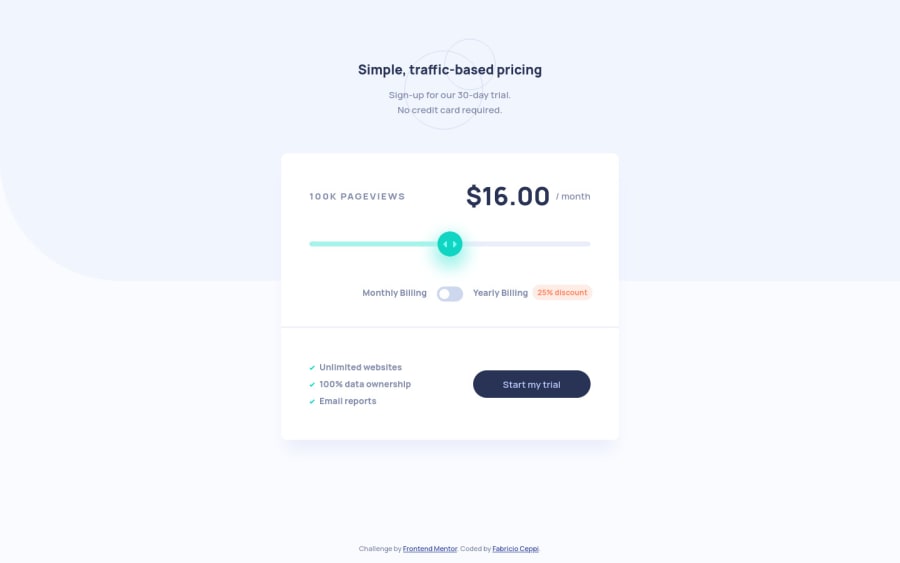
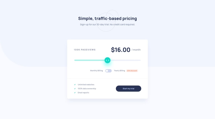
Hi everybody! Here is my solution to the Interactive Pricing Component challenge. In my opinion, the most difficult thing in this challenge is the styling of the range and radio inputs. I really had a hard time with that ugly guys.
Any suggestion is welcomed.
Community feedback
- @kens-visualsPosted about 3 years ago
Hey @fabricioceppi 👋🏻
A quick tip to fix the accessibility issue, add
aria-label="NAME_OF_THE_INPUT"to this input<input type="range" id="range" style="background: rgba(0, 0, 0, 0) linear-gradient(to right, rgb(165, 243, 235) 0px, rgb(165, 243, 235) 50%, rgb(234, 238, 251) 50%) repeat scroll 0% 0%;">and it should fix the issue. Don't forget to generate new report after fixing it.Your project looks awesome, the only suggestion I have is that it would be great if you could generate a new screenshot, so we can all admire that beauty 😃 that's it from me, cheers 👾
Marked as helpful1@fabricioceppiPosted about 3 years agoHello again @kens-visuals
Thank you for your comments! I added the aria-label to the input, and the accessibility issue disappeared. It's the first time that I use this property, I will keep it in mind for the next time.
And thank you very much for the compliment. I already actualized the screenshot. I don't know why it was looking as if the CSS wasn't loaded.
0
Please log in to post a comment
Log in with GitHubJoin our Discord community
Join thousands of Frontend Mentor community members taking the challenges, sharing resources, helping each other, and chatting about all things front-end!
Join our Discord
