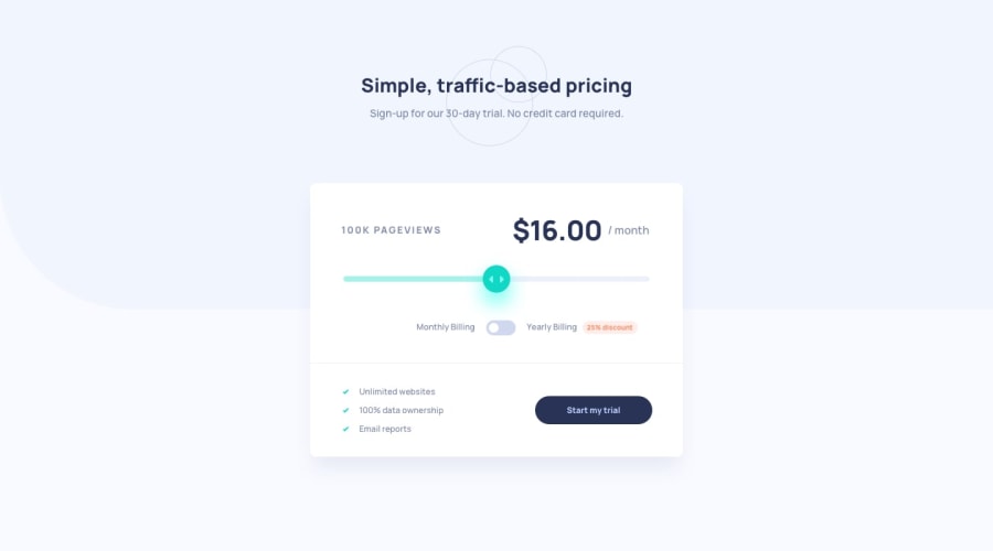
Design comparison
Solution retrospective
Hello everyone! I just finished TheOdinProject foundation course! Before I journey on full stack Javascript course, I wanted to try to do a few projects beforehand. I felt like the project itself was nothing too crazy. Please do not be afraid to leave any feedback on how to make this better. Thank you and I hope you all have a good one.
Community feedback
- @emjogalePosted over 2 years ago
Hi Kevin, I think your solution looks great - I was interested to take a look as I worked on this challenge for a while. I think some of your accessibility issues could be solved by having some semantic html sections - like a header and a main section for example. The other thing I was given some advice on was how to make the yearly discount toggle more accessible by using radio inputs rather than a checkbox. Lastly I would suggest is if you set the display of amount per month span to inline-block and specified a width it wouldn't move around when the amount changed. But maybe that's not a problem.. I think you have done a good job all round - well done!
0
Please log in to post a comment
Log in with GitHubJoin our Discord community
Join thousands of Frontend Mentor community members taking the challenges, sharing resources, helping each other, and chatting about all things front-end!
Join our Discord
