Submitted almost 4 years ago
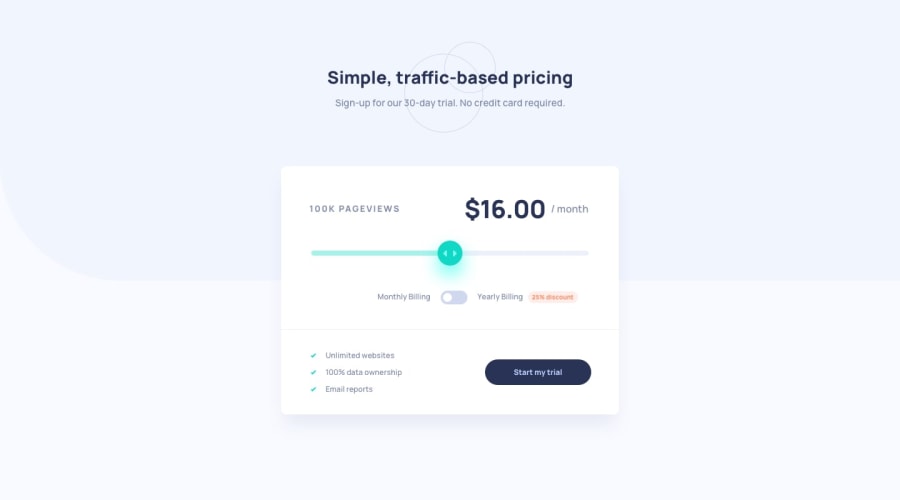
Interactive pricing component page with LESS and a sprinkle of JS
@abu-hasib
Design comparison
SolutionDesign
Community feedback
- @grace-snowPosted almost 4 years ago
Hi Abu-Hasib,
I'm afraid there's quite a few issues with this at the moment...
Mainly, Functionally this doesn't add up. It's not applying a 25% discount, and as you move the slider around it's offering different prices for the same number of page views.
Beyond that though, there are lots of problems with the html structure like
- heading elements where they shouldn't be
- empty label
- headings not in order
- inaccessible controls / labels
- headings where list items should be
I'd recommend you look at this again with real attention to semantic meaning in your html first, then go back to your javascript to address the functional errors afterwards.
I hope that's helpful for you, I don't mean to be the bearer of bad news
2
Please log in to post a comment
Log in with GitHubJoin our Discord community
Join thousands of Frontend Mentor community members taking the challenges, sharing resources, helping each other, and chatting about all things front-end!
Join our Discord
