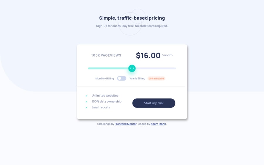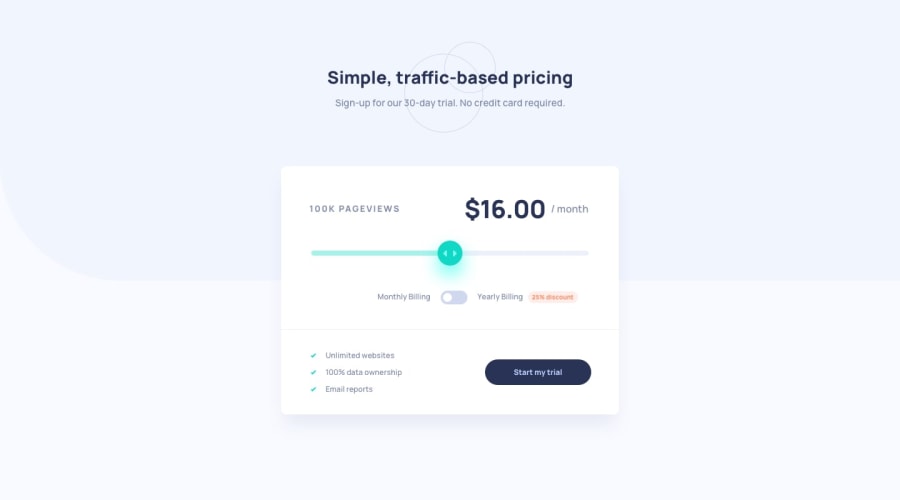
Design comparison
Solution retrospective
The only difficult thing about this was styling the range slider. It took me several hours...what a nightmare! Hopefully they add some way to make customizing this element easier.
Community feedback
- Account deleted
The 25% discount does not get applied when you click on the toggle, you should check it out.
Happy coding.
Marked as helpful2@aemann2Posted over 3 years agoOh wow, I didn't even catch that it was supposed to do that. Thanks!
0 - @ApplePieGiraffePosted over 3 years ago
Hi there, Adam! 👋
Well done on this challenge! 👍 Your solution looks good and the pricing slider works well (it's keyboard-accessible, too, which is a nice bonus)! 👏
The only very minor suggestion I have is to give the toggle-switch an outline when it is focused (just like the pricing slider and button). 😉
Keep coding (and happy coding, too)! 😁
1
Please log in to post a comment
Log in with GitHubJoin our Discord community
Join thousands of Frontend Mentor community members taking the challenges, sharing resources, helping each other, and chatting about all things front-end!
Join our Discord
