Design comparison
Solution retrospective
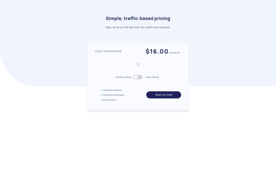
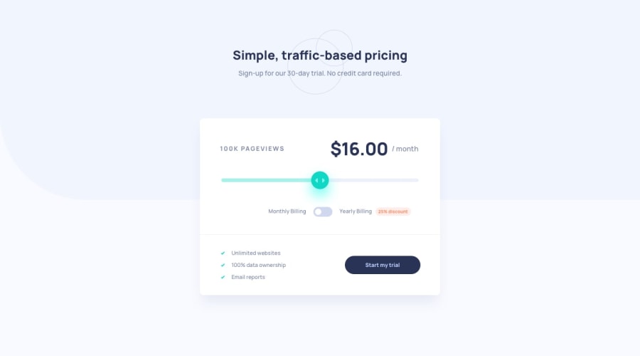
i try a lot to make this project exactly same as challenge but i can't please help me to make this better by giving your suggestions, opinions and feedback everything. And tell me where i'm wrong where i am good, how can i improve it?
Community feedback
- @MaahnoorPosted about 3 years ago
hey great job at the challenge
the readme.md file in the project resources say: If the visitor switches the toggle to yearly billing, a 25% discount should be applied to all prices.
so when a visitor toggles the switch the prices shown should be with the discount subtracted. another good practice would be to set a step on the range slide bar since we only have 5 values.
otherwise great job on the design. keep it up
Marked as helpful0@Robert170304Posted about 3 years ago@Maahnoor thanks for your suggestion i will definitely try to improve it.
1
Please log in to post a comment
Log in with GitHubJoin our Discord community
Join thousands of Frontend Mentor community members taking the challenges, sharing resources, helping each other, and chatting about all things front-end!
Join our Discord
