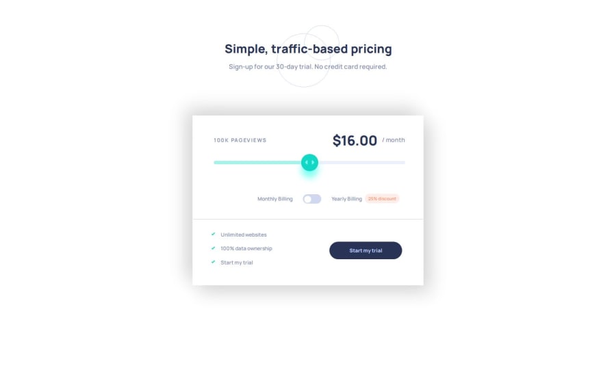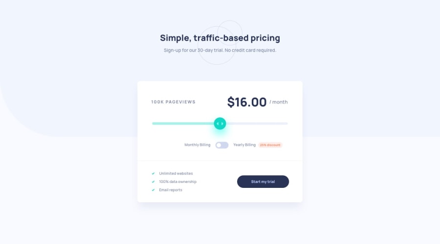
Design comparison
SolutionDesign
Solution retrospective
What are you most proud of, and what would you do differently next time?
Hi here is my solution for Interactive-pricing-component. I used HTML, CSS , JS
What challenges did you encounter, and how did you overcome them?The challenge was to stylize the input type="range" and have a correct behavior between firefox and chromium.
For firefox I didn't meet any problem, it was to make the progress bar within chromium, I struggled a lot to have a good behavior with.
Here my JS to have a progress bar within chromium.
progressBar.style.width = `calc(${Number(inputPrice.value) * 25}% - 1.25rem)`;
and with firefox I used CSS
input[type=range]::-moz-range-progress {
    background: #A4F3EB;
    height: 100%;
    border-radius: 0.5rem;
}
I think next time I will try an other way to do the progress bar.
What specific areas of your project would you like help with?Feel free to leave any comments or whether you know a way to do a progress bar in css with chromium.
Thanks.
Community feedback
Please log in to post a comment
Log in with GitHubJoin our Discord community
Join thousands of Frontend Mentor community members taking the challenges, sharing resources, helping each other, and chatting about all things front-end!
Join our Discord
